Turning an Instagram metrics tool into something an agency can actually steer.
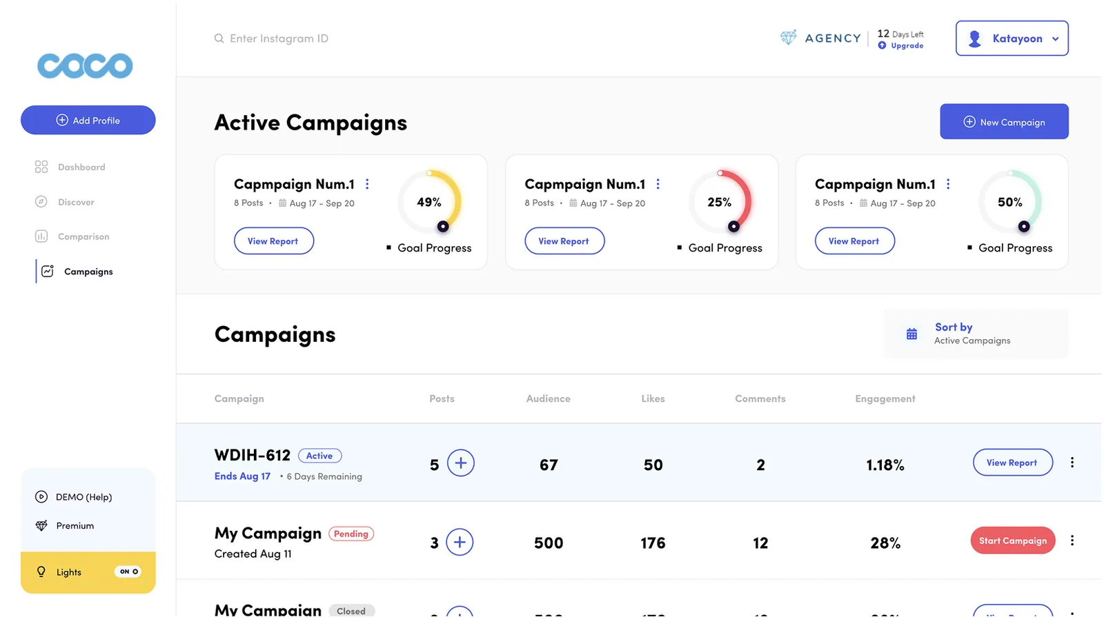
- Problem
- Coco compared Instagram profiles, then stopped exactly where the work began. Agencies were pasting its numbers into spreadsheets to run a campaign.
- My role
- Campaigns module end to end, the profile and comparison redesign, and plans, purchase and referral.
- Outcome
- Coco stopped reporting numbers and started reporting progress.
Coco started as a way to look up an Instagram profile and compare its numbers with someone else’s. Useful — but it stopped exactly where the work began.
Agencies were pasting those numbers into spreadsheets to run a campaign: which posts count, whether the goal is on track, what goes in the client report. I redesigned the analytics surfaces, designed Campaigns to keep that work inside the product, and shaped the plan and purchase flow that pays for it.
Runs several client campaigns at once. Opens Coco to answer one question first: which one is behind, and by how much.
Tracks a single profile. Wants growth, best posting days and top posts without learning an analyst’s vocabulary.
Twelve days left on the Agency trial. Every screen has to show the paid ceiling without nagging.
Give the numbers a goal to be measured against.
430K audience means nothing on its own. Against a 900K goal it is 30% of the way there — a number a manager can defend on a client call.
Posts, dates and four separate goals in one sitting. Split into General info and Goals, setup stops feeling like paperwork.
Social teams keep this open from morning to late. Dark mode was never a flourish — it was a constraint the data colours had to survive.
Three rules held every screen together, light and dark.
A ring with a marker, everywhere: campaign card, campaign header, every goal. Learned once on the list, read instantly on the detail.
Green on track, yellow watch it, red behind. Charts and statuses share one palette, so a bar means something before it is read.
Pending gets Start, active gets View Report. State picks the button, so the table doubles as a to-do list.
The original product was a lookup table: add a profile, read the row, decide by yourself.
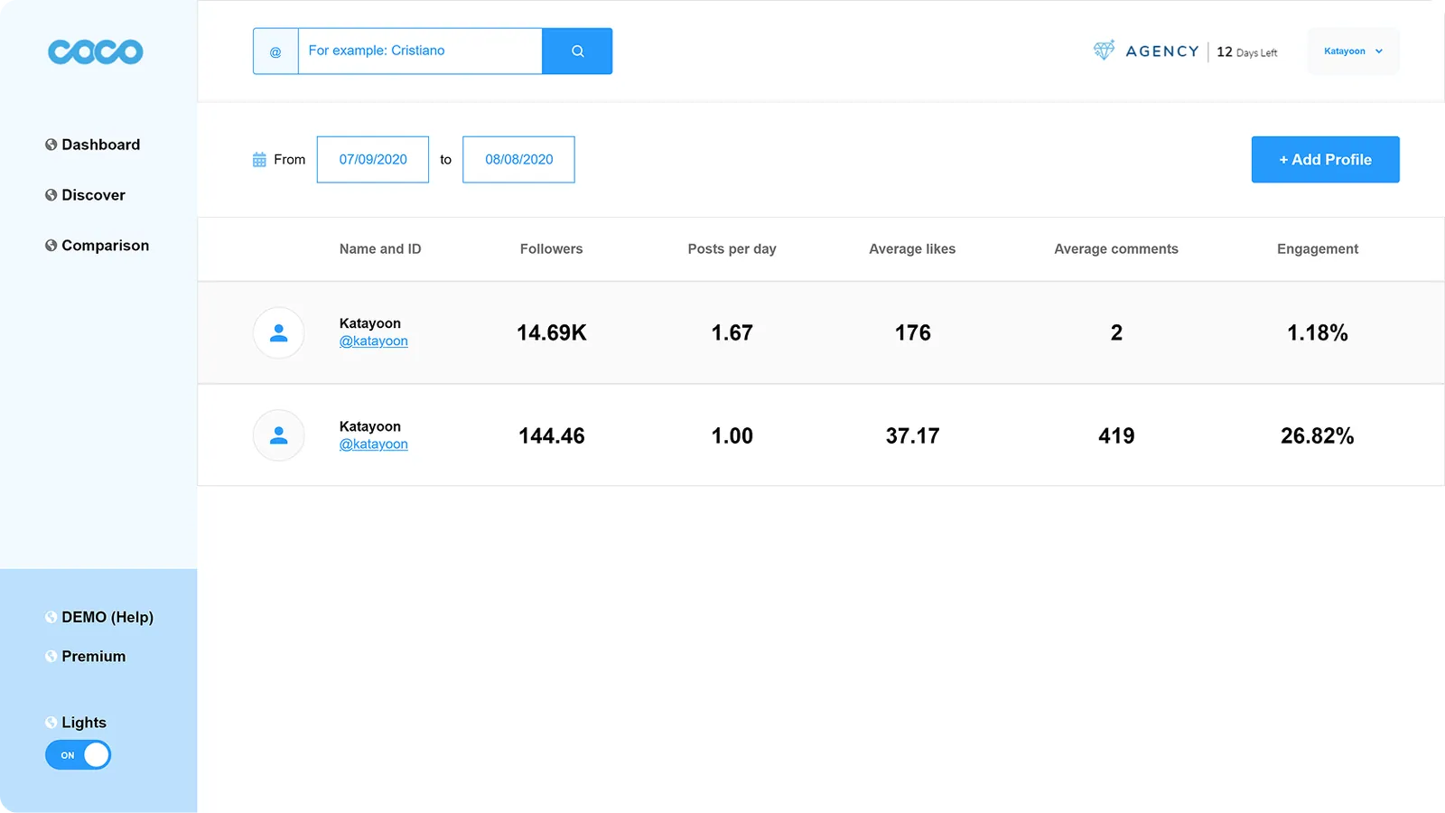
Seven equal columns, no hierarchy — engagement, the number people act on, weighed the same as posts per day.
Nothing said whether 1.18% was good. Every judgement was made outside the product.
The redesign kept the table and gave it a job: rank, compare, then hand off to a profile or a campaign.
Eight numbers, ranked by how often someone repeats them out loud.
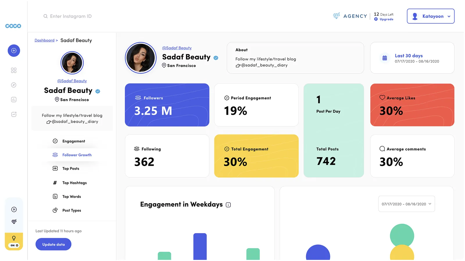
monitoring Overview. Four headline metrics get filled tiles; everything else sits on white. The rail keeps the profile pinned while Engagement, Follower Growth, Top Posts, Hashtags, Words and Post Types scroll past. “Last updated 11 hours ago” plus a manual refresh is there to be honest about one thing: this data is fetched, not live.
Active work on top as cards, the full history underneath as a sortable table.
What a manager checks between meetings sits above the fold: three live campaigns with goal rings, and one route to a new one. The table below belongs to the weekly review, not the daily one.
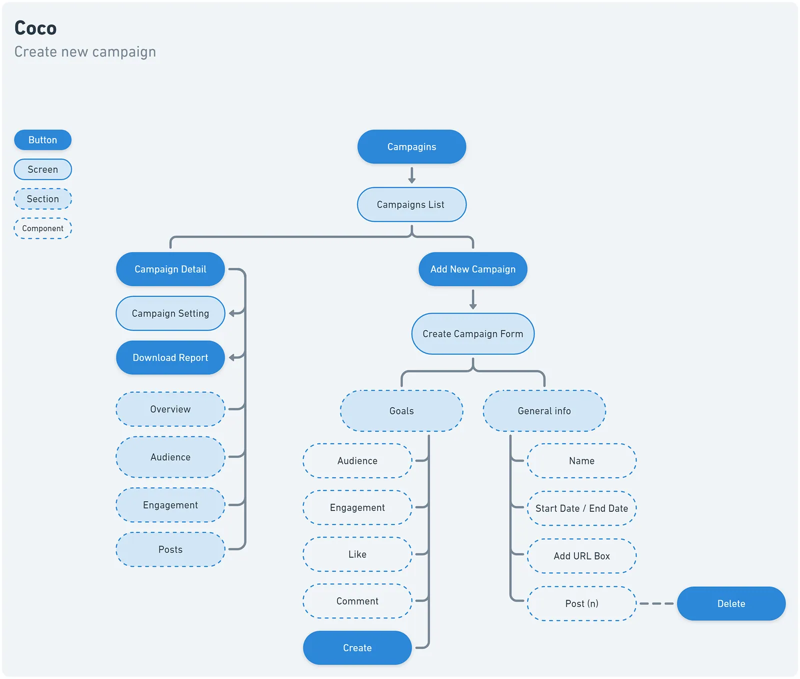
account_tree The flow, first. Every screen, section, component and button in the module, mapped before any pixels. It settled the two hard calls early: creation splits into General info and Goals, and a campaign detail is four sections behind one header — not four pages.
view_list Campaigns list. Every row says three things: status as a badge, deadline in plain words — “Ends Aug 17 · 6 days remaining” — and the next action as the only filled button in the row. Pending gets a red Start; closed drops to an outline.
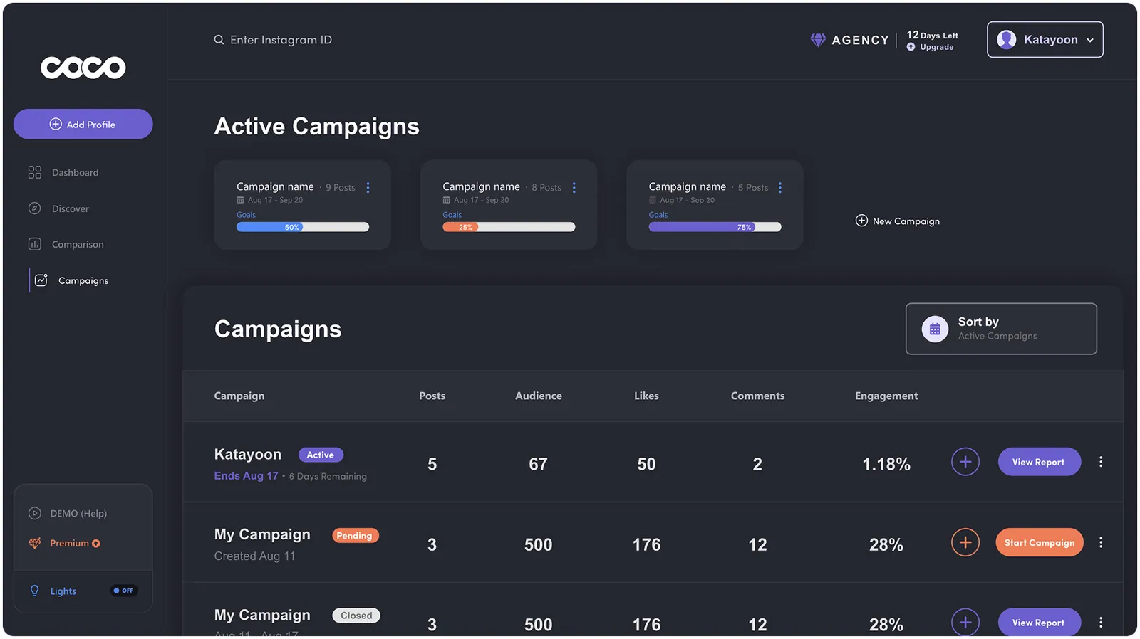
dark_mode Dark theme. Not an inversion. Surfaces become layered charcoal, indigo lifts to stay legible against it, and goal rings become bars where a thin stroke would have vanished. The Lights toggle keeps the same place and its own colour in both themes, so nobody hunts for the way back.
Every figure paired with the goal it is being judged against.
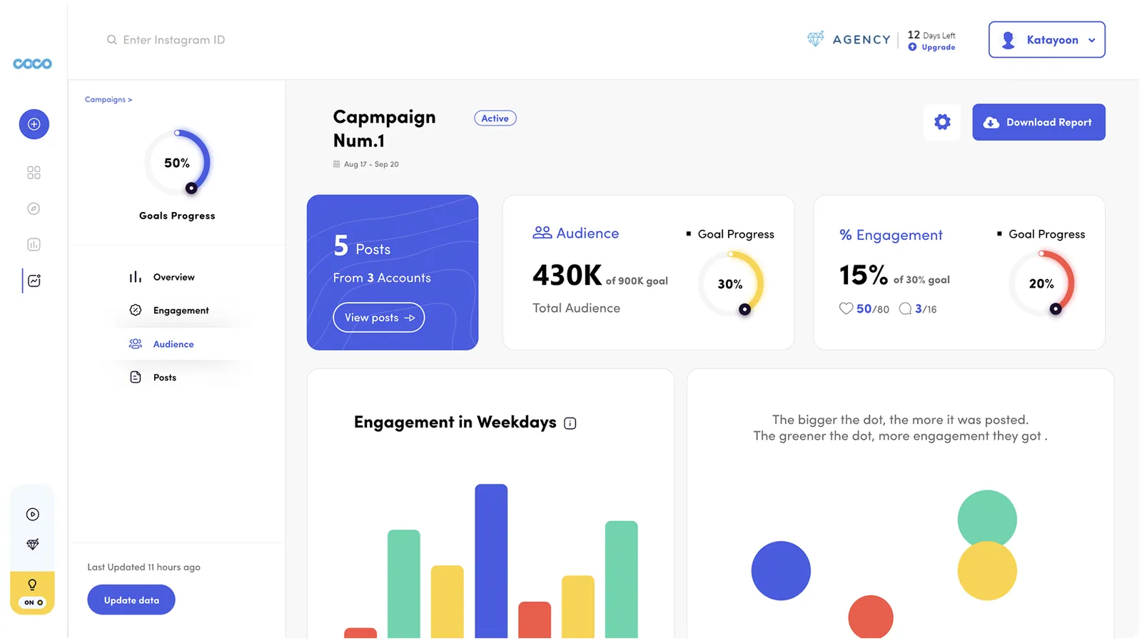
insights Overview. “430K of 900K goal”, with the 30% ring beside it. “15% of 30% goal”, with likes and comments broken out below. Overall progress lives in the rail so it survives Overview, Engagement, Audience and Posts — and Download Report is the only primary button on the page, because that is how most sessions end.
Green rings and green bars say the same thing — no separate legend per chart.
Yellow is the honest middle: moving, but not fast enough to make the date unchanged.
Red lands on data before it lands on buttons, so it reads as a fact, not a scolding.
Upgrading is a settings task, not a marketing page.
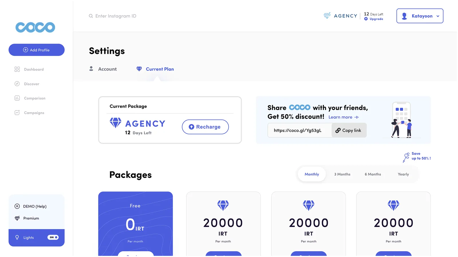
receipt Current plan. What you have and how long it lasts, before what you could buy. The term switch sits above the cards so all four prices change in place — no second table to scroll to.
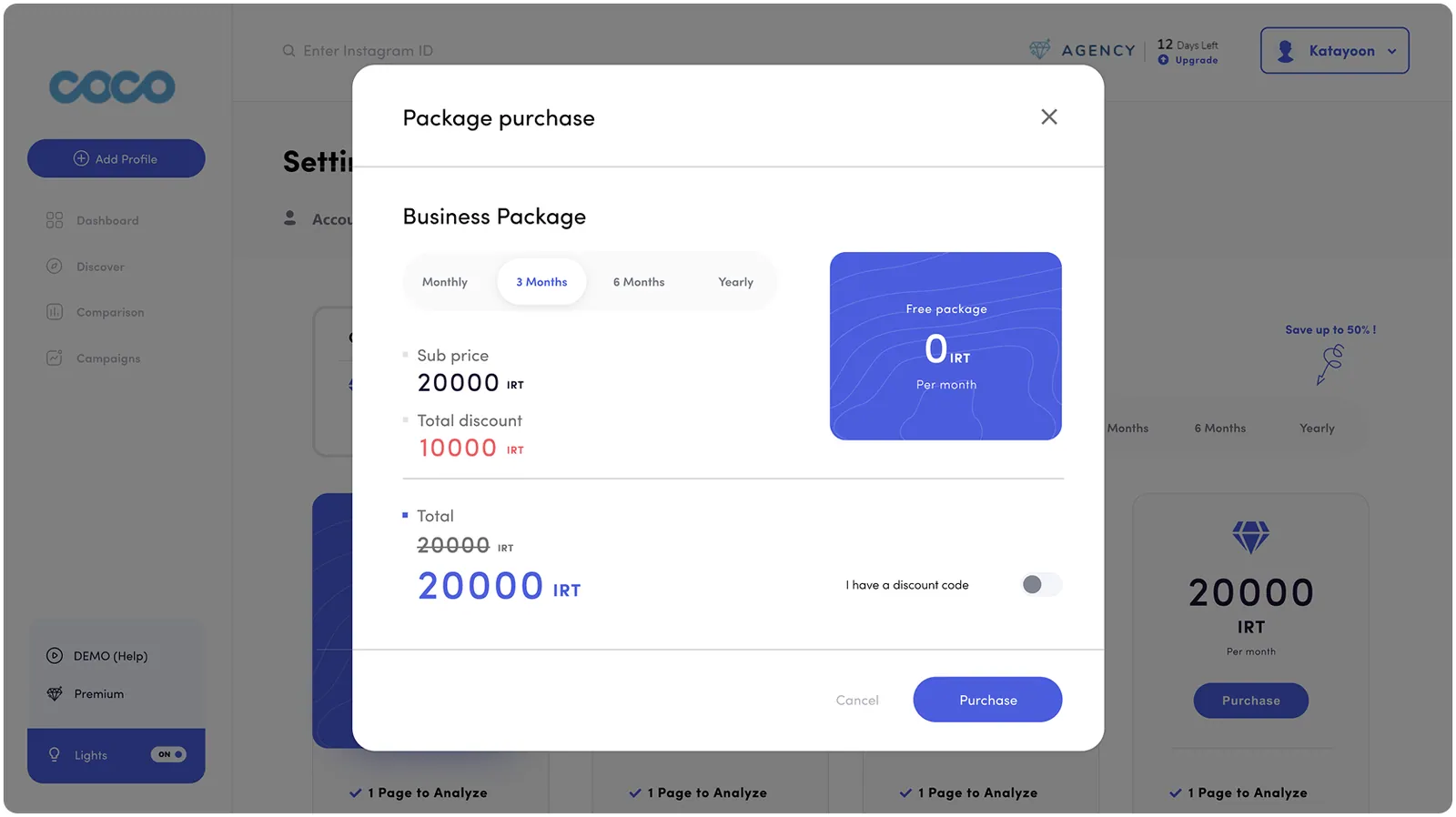
shopping_bag Purchase. Sub price, discount in red, then the old total struck through and the new one restated — the arithmetic shown, not summarised. The discount-code field stays behind a toggle, so an empty box never suggests a deal is being missed.
Indigo is the brand and the interactive colour; nothing else is tappable-looking. The other three belong to status and charts — the same three in both themes, so the scale is learned once and read everywhere.
DARK SURFACE
BRAND
ON TRACK
WATCH
BEHIND
SURFACE
Coco stopped reporting numbers and started reporting progress.
What the agency sees, in order
The old tool answered 'what happened'. Click through and the sequence answers 'against what' — profile, campaigns, then a single campaign measured against its goal.