CarbonPath
Logistics software that puts a carbon number on every shipment.
- Problem
- One product answering to five very different audiences on freight emissions — and nobody had ever watched a user touch it.
- My role
- Only designer: product UI and UX, the usability test protocol and research, plus the brand and the go-to-market artefacts.
- Outcome
- Launched with the post-test vocabulary and a corrected invitation flow. A partially-saved-plan bug was caught in a session rather than by a customer, and testing became routine.
Context
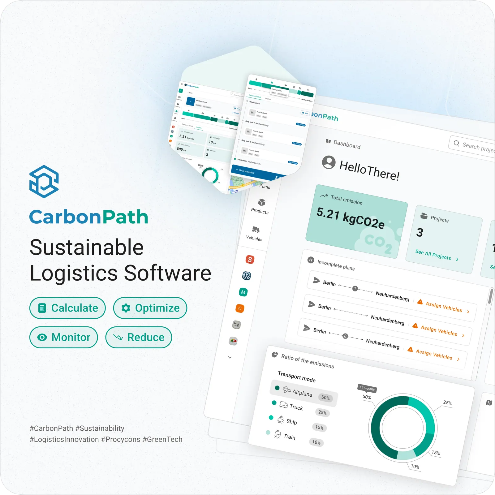
CarbonPath is a sustainable-logistics platform for the people who have to answer for freight emissions: sustainability managers, purchasing and sales teams, R&D, and the consultants they hire.
One product, five very different audiences — carriers, e-commerce shippers, manufacturers and consultants — all needing the same numbers for different arguments. The calculation engine was the company's expertise. Making it legible was not.
I was the first and only designer. That meant the product UI and UX, the usability testing programme, and everything the company showed the outside world: logo, landing page, decks, documents and social graphics.
What I owned
Being the only designer means the product and the pitch have to sound like the same company.
The problem
The interface was clear. The vocabulary was not.
Usability test
Nobody had watched a user touch CarbonPath. Seven task scenarios across the spine of the product, run remotely, an hour per participant, with a second teammate observing.
After every task, participants rated findability, orientation and predictability. I recorded completion, errors and time on task alongside, so a complaint could always be checked against behaviour.
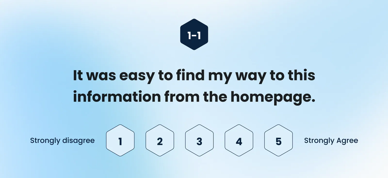
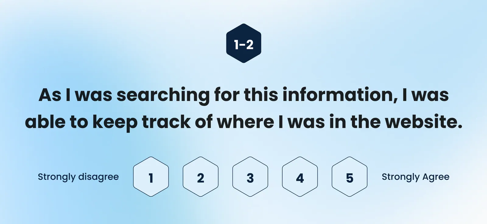
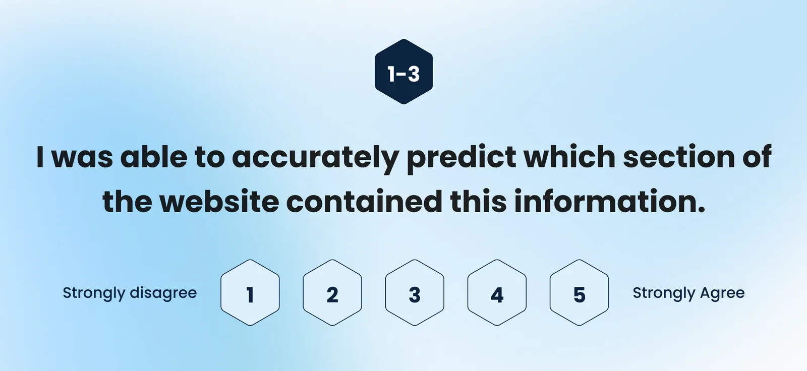
Every participant got through sign-up, project creation, vehicle creation and the dashboard. Task 1 scored a clean 5.0.
Plan creation was called intuitive — the reminders and the visual list of assigned vehicles were named as the reason.
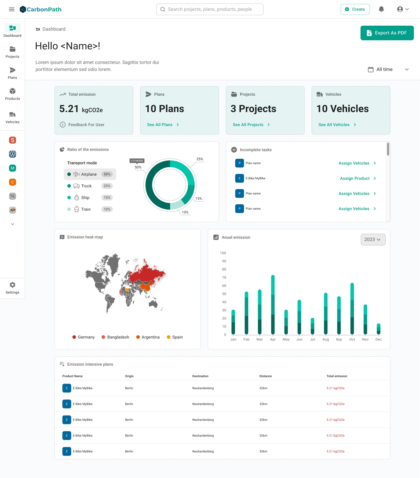
The insights dashboard was the most-praised screen: filterable, visual, appealing. Its problem was language, not layout.
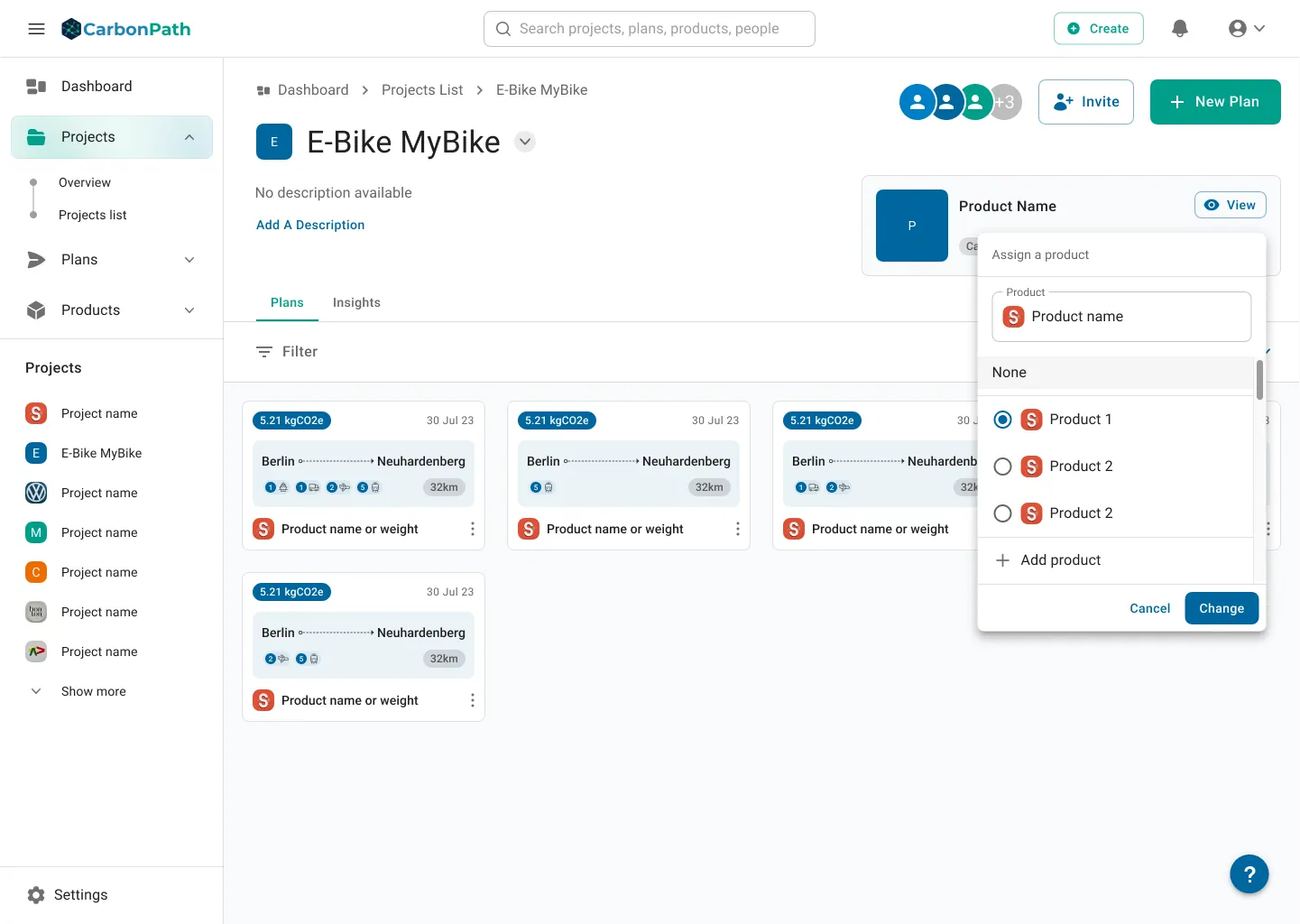
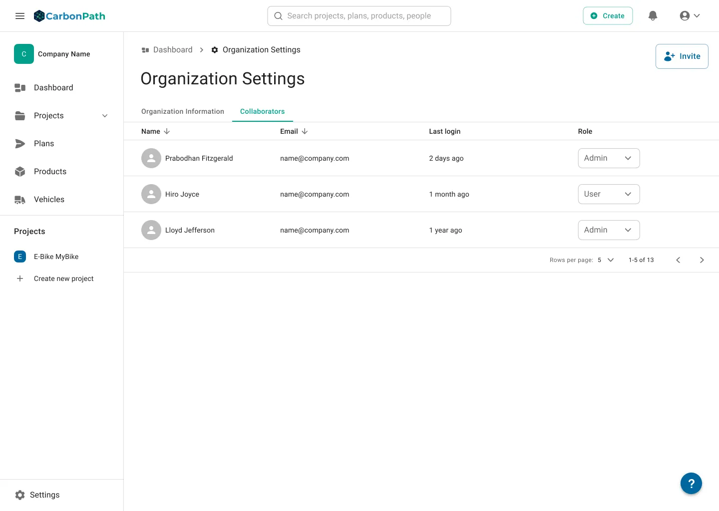
The one critical error: a user tried to hand the Owner role to a collaborator and the invitation flow let them believe it would work.
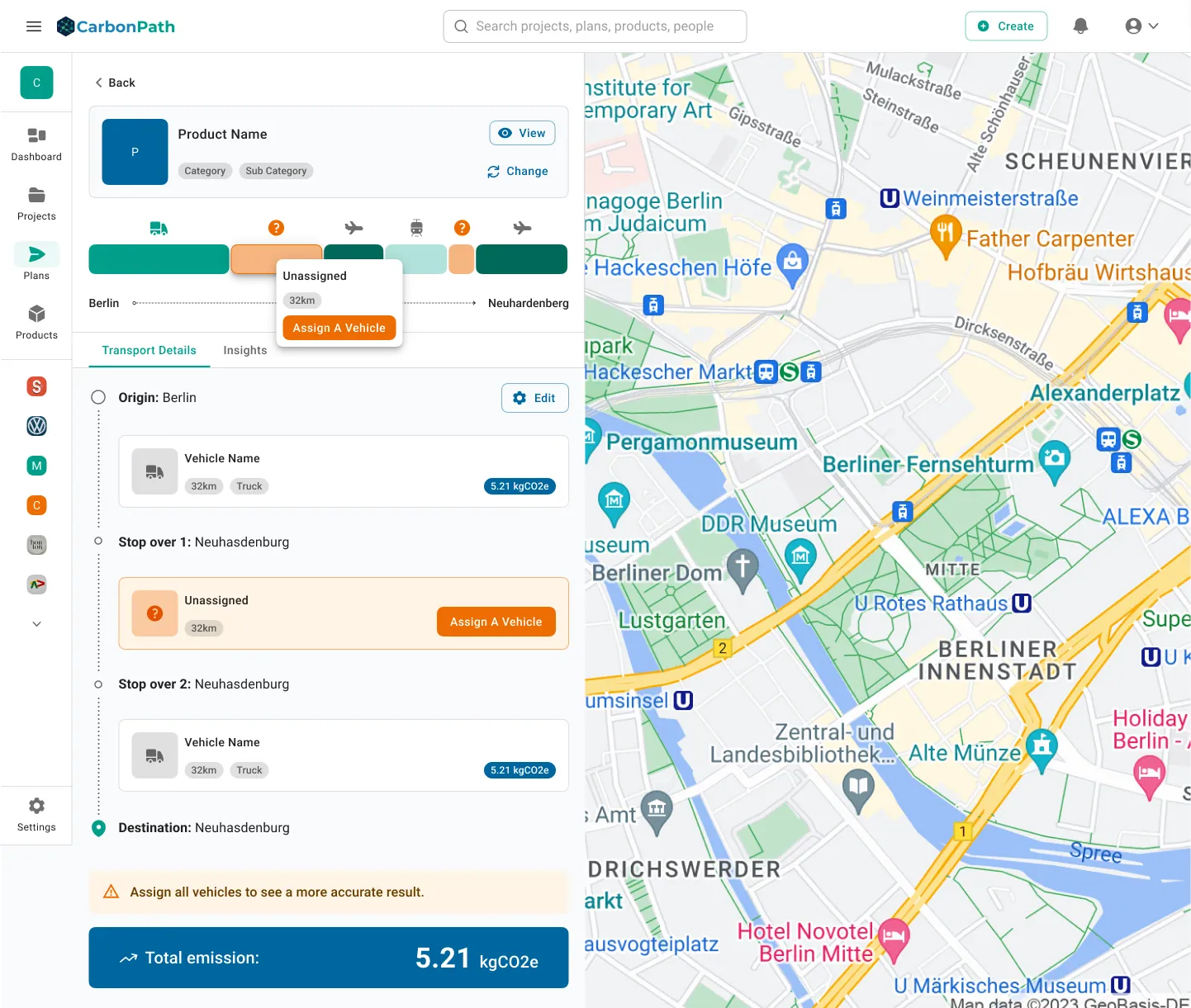
Unassigned and unconfirmed vehicles looked alike, so people could not see what was still missing before saving a plan.
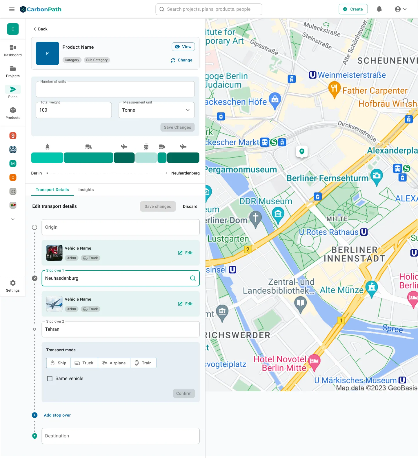
A partially completed plan did not save reliably — a bug the test caught before launch, not after.
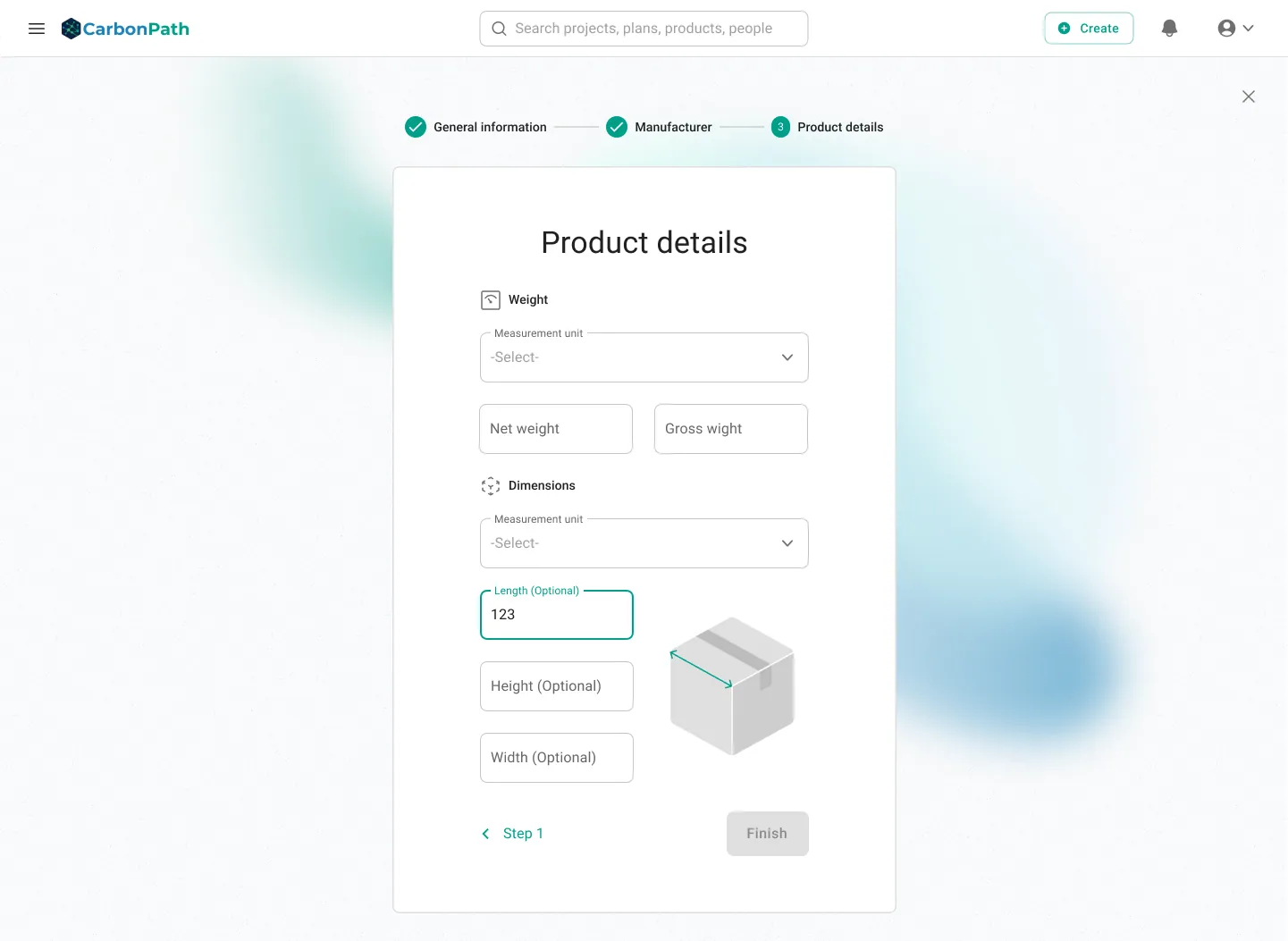
The screens
Writing it down
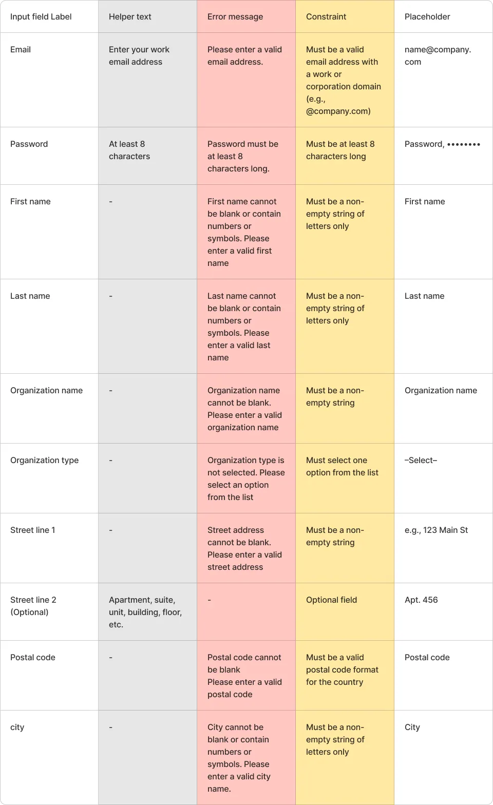
The terminology fix only holds if it is written somewhere. So every input field got a specified label, helper text, error message, constraint and placeholder.
Everything else
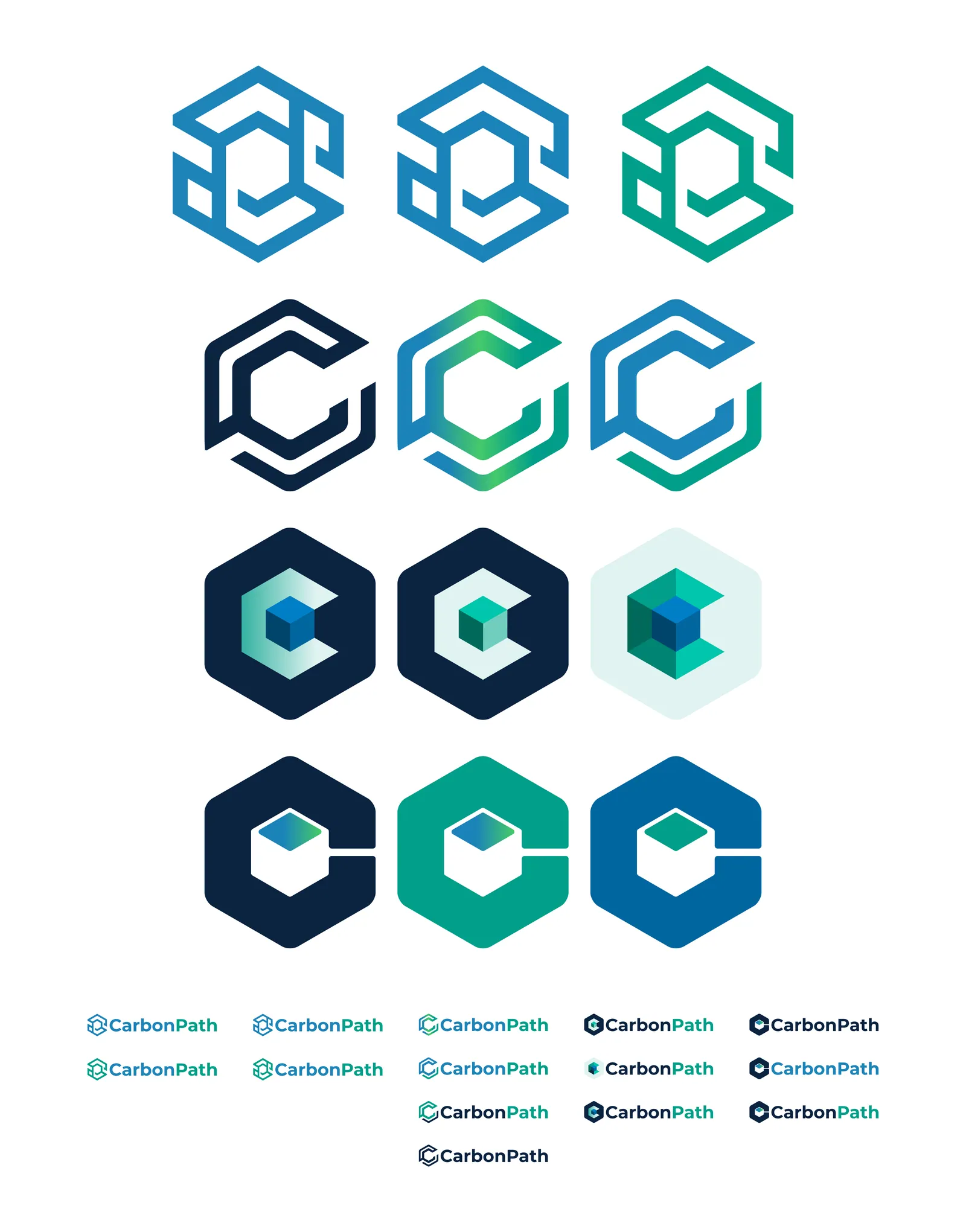
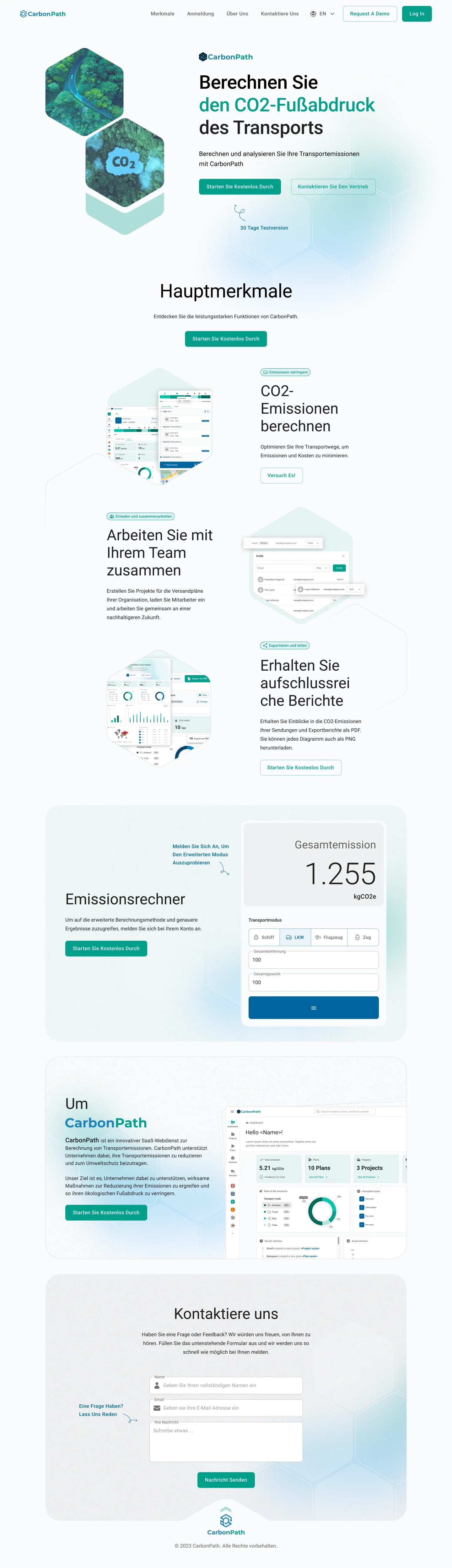
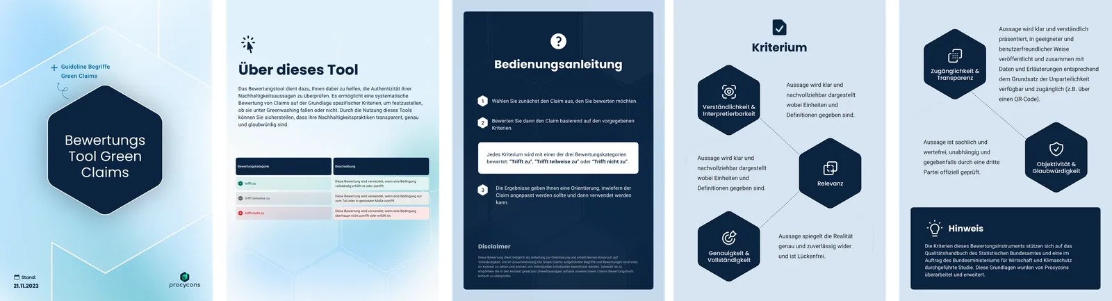
A sustainability product is judged on credibility, and credibility is cumulative. The logo, the landing page, the sales deck and a LinkedIn post all had to agree.
One small kit — hexagon mark, blue-to-teal palette, type scale, chart styling — and every artefact drew from it, vocabulary included.

I ran the test with four people instead of waiting for eight, and shipped the fixes anyway.
The report says plainly that eight to ten participants is the number for stable results, and that this was round one. Four is enough to find broken things; it is not enough to claim a rate.
All four hit the same terminology wall and the same ownership trap. A fifth participant was not going to change what to fix first.
A launch date was fixed. Recruiting to ten would have moved the fixes past it, which means shipping known defects to be more rigorous about them.
Outcome
A product that reads as clear, and a company that had never tested one before.
What I'd change: the participants were all internal. They are pro users of the domain, which is exactly why the terminology problem was so telling — if LCA-adjacent colleagues could not define "emissions intensity" on this screen, a purchasing manager certainly could not. Round two needed real customers, and a task written specifically around defending a number to someone else.
From a number on a dashboard to the vehicle that caused it
Carbon accounting is only useful if you can trace a total back to a decision. Click through and the chain holds: dashboard, project, the plan, and the transport leg with the unassigned vehicle flagged.