Driverly
Shipped as Drivo — renamed to Driverly. The screens below carry the original branding.
A car telematics app that pays you back for driving well.
- Problem
- An insurer wanted to price cover on how someone actually drives, not a flat rate. The telematics data existed; a product around it did not.
- My role
- First and only designer. IA through UI to engineering handoff, iOS and Android, end to end.
- Outcome
- Shipped and live on both stores — and the product went on to win an industry prize with these designs.
Context
An insurance provider wanted to price cover on behaviour instead of a flat rate: track how the customer actually drives, score it, and reward the safe ones. The telematics data existed. A product around it did not.
I came in as the first designer on it and owned the mobile app end to end — information architecture, flows, every screen, the UI kit and the developer handoff. There was no design language to inherit, so the system in these screens is the one I built.
It shipped, it has since won an award, and the team still builds on those designs.
The problem
Telematics is easy to sell as surveillance and hard to sell as a benefit.
How I worked
No research budget and a tight build window, so I leaned on the two inputs I did have and made the structure the first deliverable.
I went through the telematics apps already on the market to see how they handled scoring, mileage and rewards. Most buried the score inside a report, or gamified so hard the policy disappeared. That gap set my hierarchy: score first, policy always one tap away.
Working sessions with the underwriting and engineering sides told me which signals were actually measurable — mileage, night driving, braking, speeding — and what the business could afford to give back. Everything on screen is a number the system can really produce.
Architecture
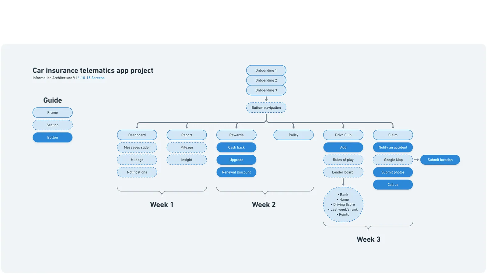
I mapped the whole app to around 10–15 screens before drawing anything, then cut it into three build weeks so engineering could start on week one while I designed week two.
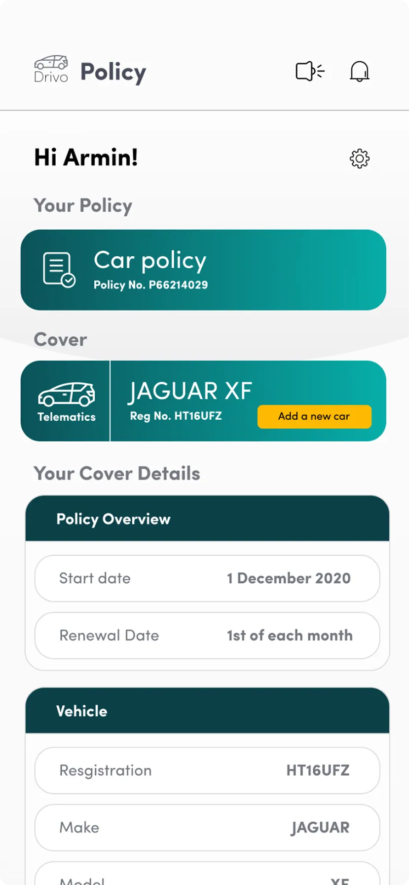
Five bottom-nav destinations: Dashboard, Report, Rewards, Policy, Drivo Club. Solid pills are actions, dashed ones are sections — a small legend that let non-designers read the map without me in the room.
The screens
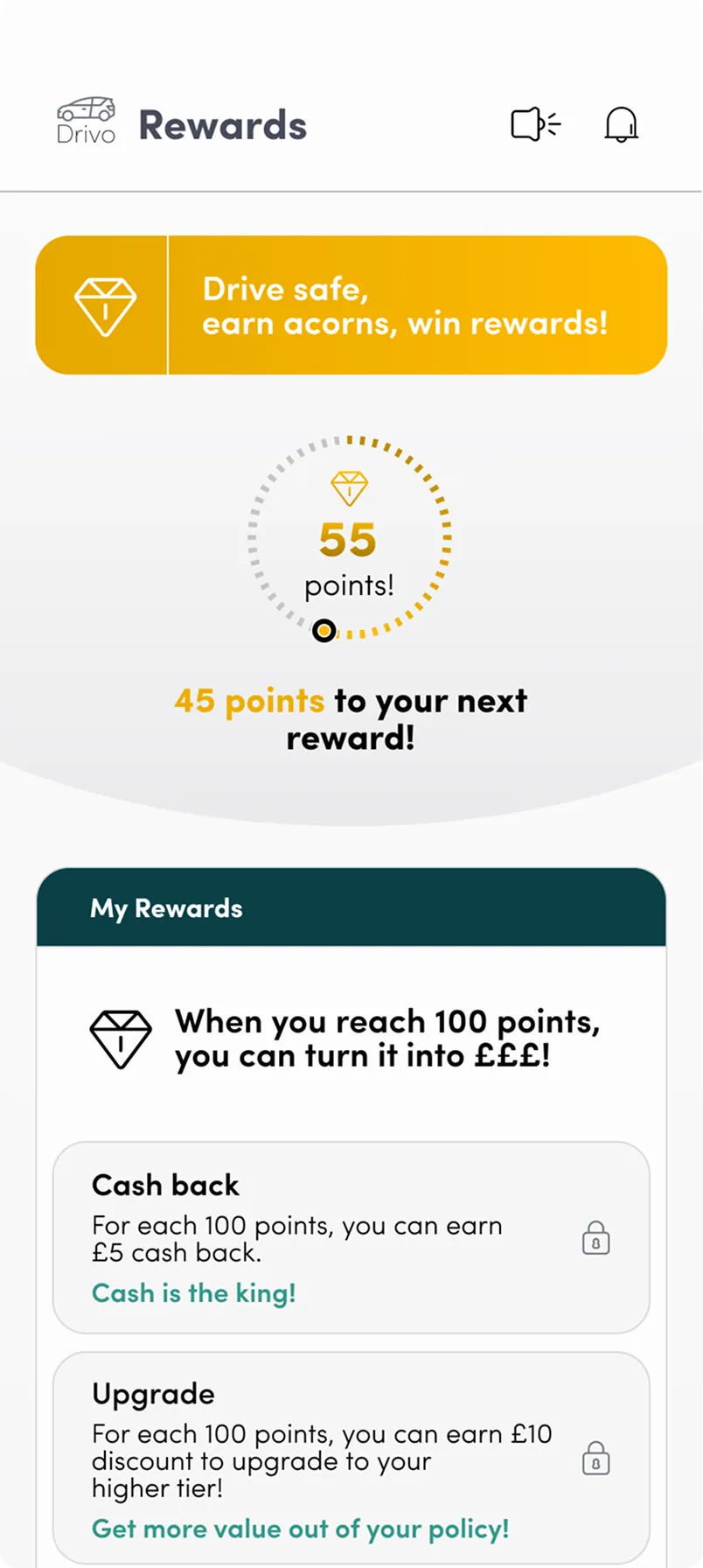
Deep teal for anything factual, amber for anything you earn. One accent per job, so the reward layer never gets confused with the policy layer.
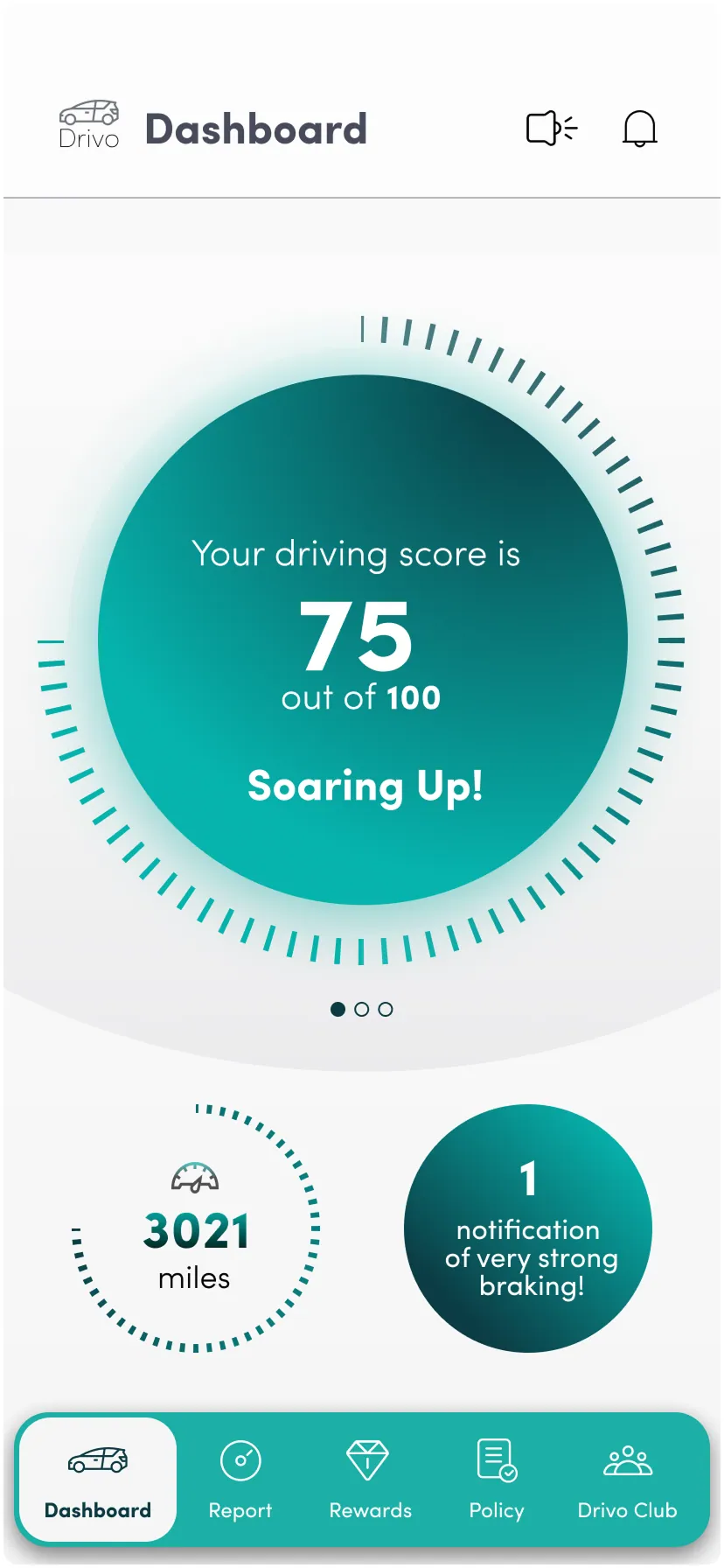
The dashboard answers one question — am I doing well? — and everything else is a tap away.
The dial takes most of the first viewport. On a glance-length visit, the driver has already got what they came for.
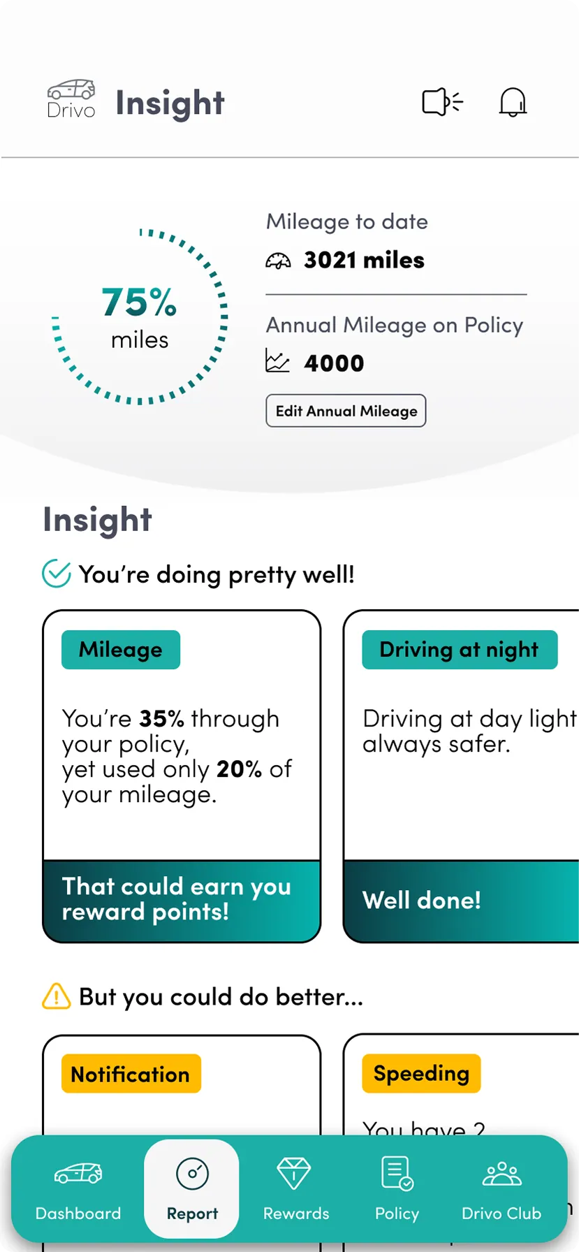
Every metric gets a plain-language read: "Soaring Up!", "You're doing pretty well!", "1 notification of very strong braking". No interpretation required.
The same dial language repeats in Report and Rewards, so the driver learns one chart and reads three screens.
Try it
Two clickable prototypes: the sign-up flow, and the dashboard-to-rewards loop.
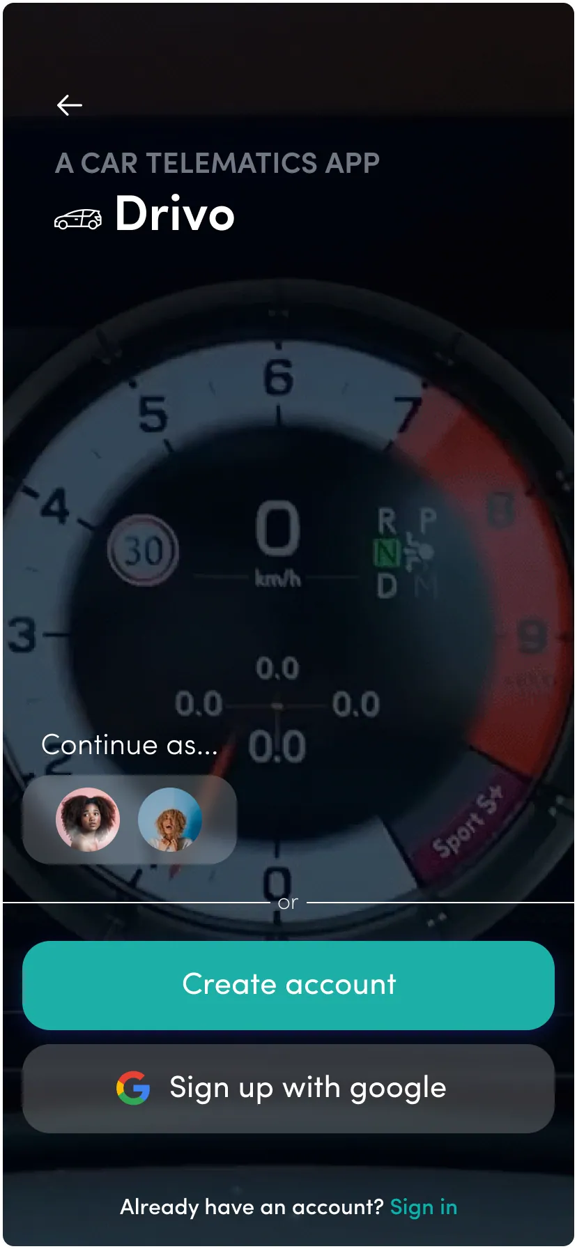
Onboarding to reward, in five screens
The loop the whole product hangs on: sign in, see the score, understand why it moved, and find the reward it unlocks.
Outcome
Shipped, live, and still the design the team builds on.
If I picked it up again, the first thing I'd buy is usability testing on the score dial. It tests well as an idea, but I'd want to watch a driver see a falling score and check that the tone still lands as encouragement rather than a telling-off.