Katayoon.Samadi ← ALL PROJECTS
CASE STUDY

CarbonPath

Logistics software that puts a carbon number on every shipment.

B2B WEB APP USABILITY TESTING FIRST & ONLY DESIGNER BRAND + PRODUCT
ROLE
First and only designer
SCOPE
Research → UI → brand
COMPANY
Procycons — 2023
Problem
One product answering to five very different audiences on freight emissions — and nobody had ever watched a user touch it.
My role
Only designer: product UI and UX, the usability test protocol and research, plus the brand and the go-to-market artefacts.
Outcome
Launched with the post-test vocabulary and a corrected invitation flow. A partially-saved-plan bug was caught in a session rather than by a customer, and testing became routine.
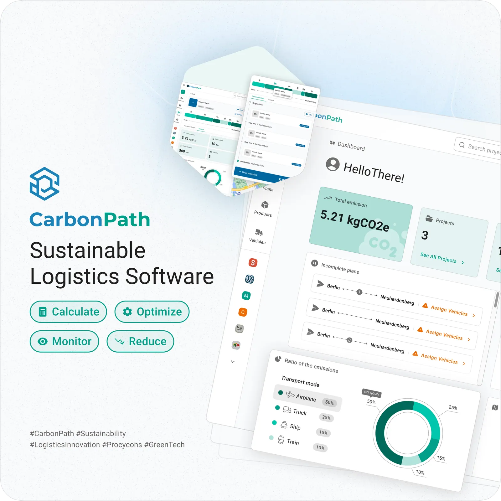
CarbonPath launch graphic showing the dashboard and emission insights

Context

CarbonPath is a sustainable-logistics platform for the people who have to answer for freight emissions: sustainability managers, purchasing and sales teams, R&D, and the consultants they hire.

One product, five very different audiences — carriers, e-commerce shippers, manufacturers and consultants — all needing the same numbers for different arguments. The calculation engine was the company's expertise. Making it legible was not.

I was the first and only designer. That meant the product UI and UX, the usability testing programme, and everything the company showed the outside world: logo, landing page, decks, documents and social graphics.

What I owned

Being the only designer means the product and the pitch have to sound like the same company.

PRODUCT
Feature UI & UX

Projects, plans, products, vehicles and the emission insights dashboard — flows, screens and the patterns they share.

RESEARCH
Usability testing

Wrote the protocol, ran remote moderated sessions, scored the rating scales and task metrics, and published the report the team worked from.

BRAND
Logo & visual language

The hexagon mark, the blue-to-teal palette and the type rules that then carried into the app, the site and every deck.

GO-TO-MARKET
Landing page & comms

Marketing site, sales and event decks, handouts and printed documents, plus the social and campaign graphics.

The problem

The interface was clear. The vocabulary was not.

TENSION 01
Domain words look like UI words

Net weight, gross weight, source, region, key, value, intensity, emissions ratio. Every one is precise to an LCA expert and guesswork to a purchasing manager.

TENSION 02
Two nested objects, one mental model

A project holds plans; plans hold products and vehicles. Users could do both tasks and still not be able to say which was which.

TENSION 03
Numbers no one can source

Emissions figures are only useful if you can defend them. Users could not tell whether a chart came from their own project data or an external factor set.

Usability test

Nobody had watched a user touch CarbonPath. Seven task scenarios across the spine of the product, run remotely, an hour per participant, with a second teammate observing.

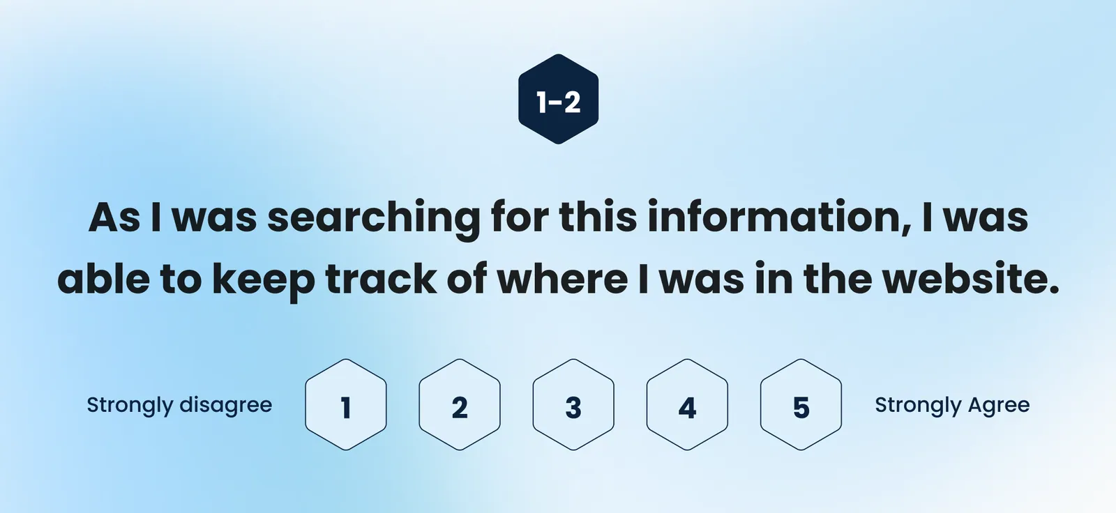
After every task, participants rated findability, orientation and predictability. I recorded completion, errors and time on task alongside, so a complaint could always be checked against behaviour.
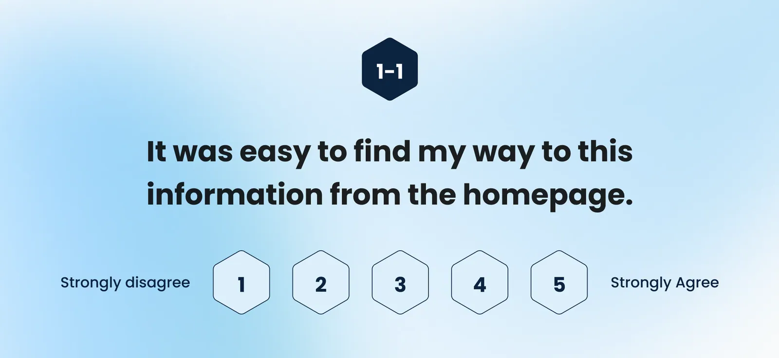
Rating scale slide: it was easy to find my way to this information from the homepage
Rating scale slide: I was able to keep track of where I was in the website
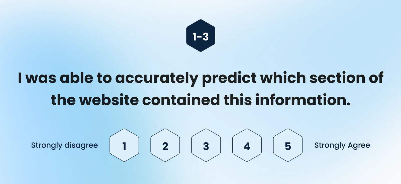
Rating scale slide: I was able to accurately predict which section contained this information
THE THREE POST-TASK STATEMENTS, ASKED IDENTICALLY AFTER ALL SEVEN SCENARIOS
7
TASK SCENARIOS
4
PARTICIPANTS, ROUND 1
4/7
TASKS AT 100% COMPLETION
1
CRITICAL ERROR FOUND
TASK
COMPLETED
EASE OF FINDING
PREDICTABILITY
01 — Log in & sign up
100%
5.0
4.3
02 — Create a new project
100%
4.5
4.3
03 — Invite someone to a project
75%
4.0
3.8
04 — Create a new product
75%
3.8
4.5
05 — Create a new plan
75%
4.0
3.3
06 — Create a new vehicle
100%
4.0
3.5
07 — Review the emission insights
100%
3.3
3.3
MEAN AGREEMENT, 5-POINT SCALE — RED = BELOW THE 4.0 THRESHOLD I SET FOR "GOOD ENOUGH"
WHAT HELD UP

Every participant got through sign-up, project creation, vehicle creation and the dashboard. Task 1 scored a clean 5.0.

Plan creation was called intuitive — the reminders and the visual list of assigned vehicles were named as the reason.

The insights dashboard was the most-praised screen: filterable, visual, appealing. Its problem was language, not layout.

WHAT BROKE

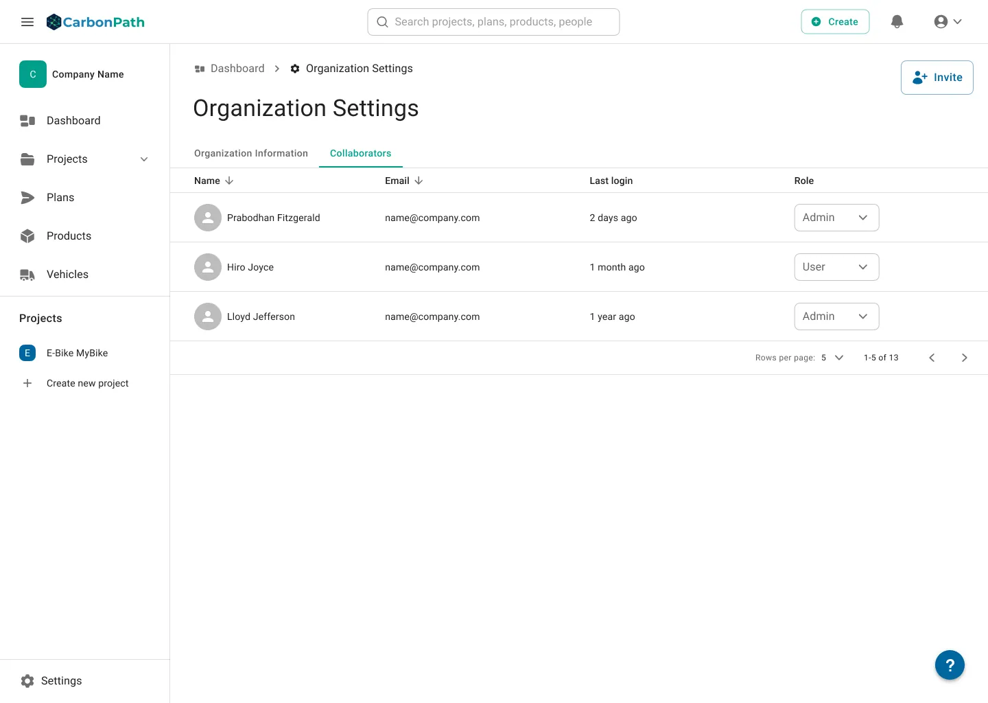
The one critical error: a user tried to hand the Owner role to a collaborator and the invitation flow let them believe it would work.

Unassigned and unconfirmed vehicles looked alike, so people could not see what was still missing before saving a plan.

A partially completed plan did not save reliably — a bug the test caught before launch, not after.

The screens
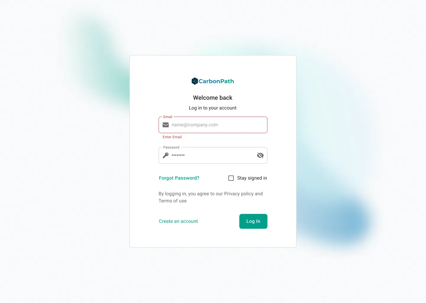
CarbonPath log in screen with inline validation
01 — ACCOUNT
The task that scored 5.0
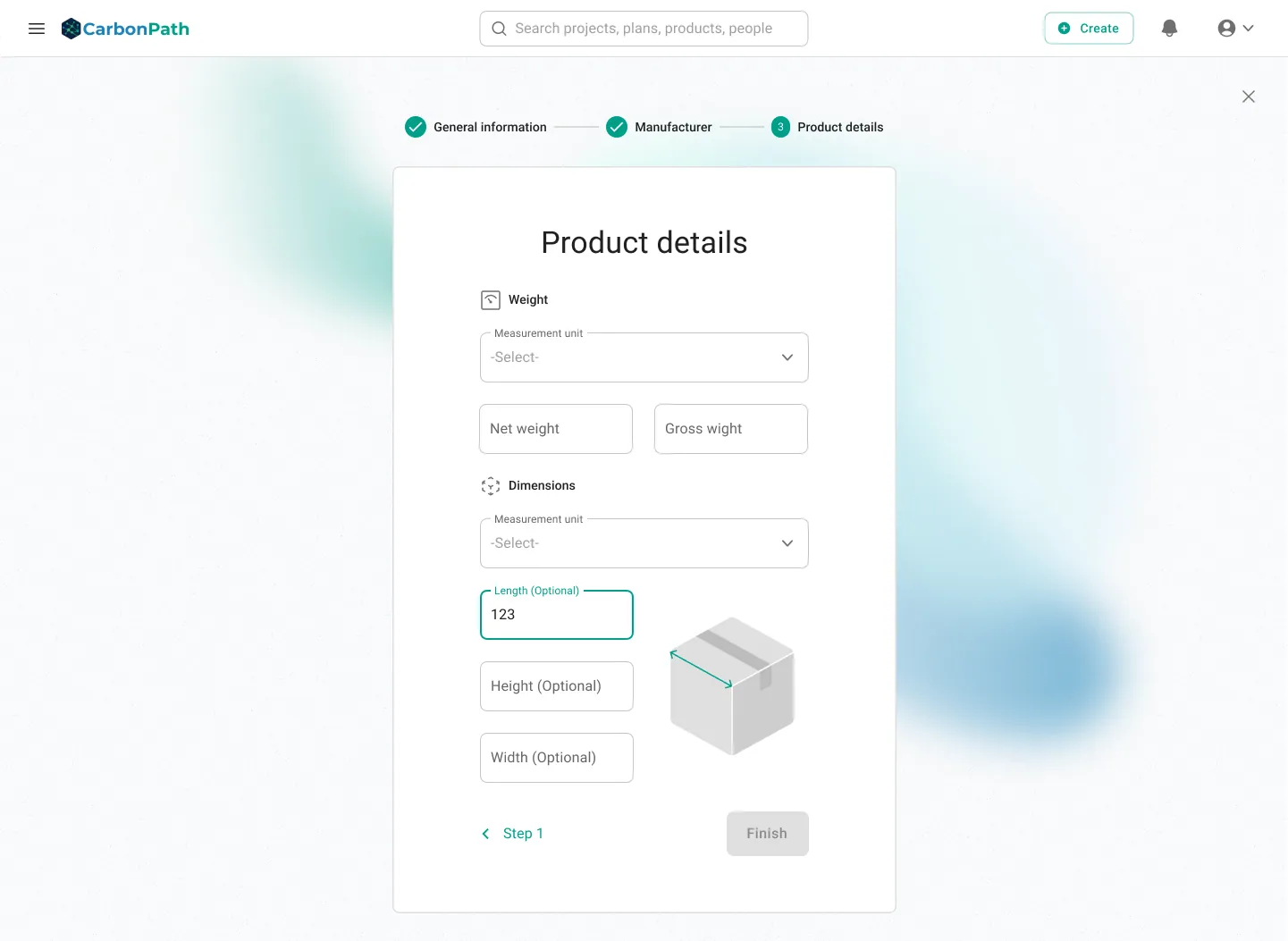
Product details step of the create-product flow
02 — PRODUCTS
Where the vocabulary hurt most

Net versus gross weight sat in the same row and meant nothing to most testers. Stepped into three stages, with the plain-language definitions attached to the fields themselves.

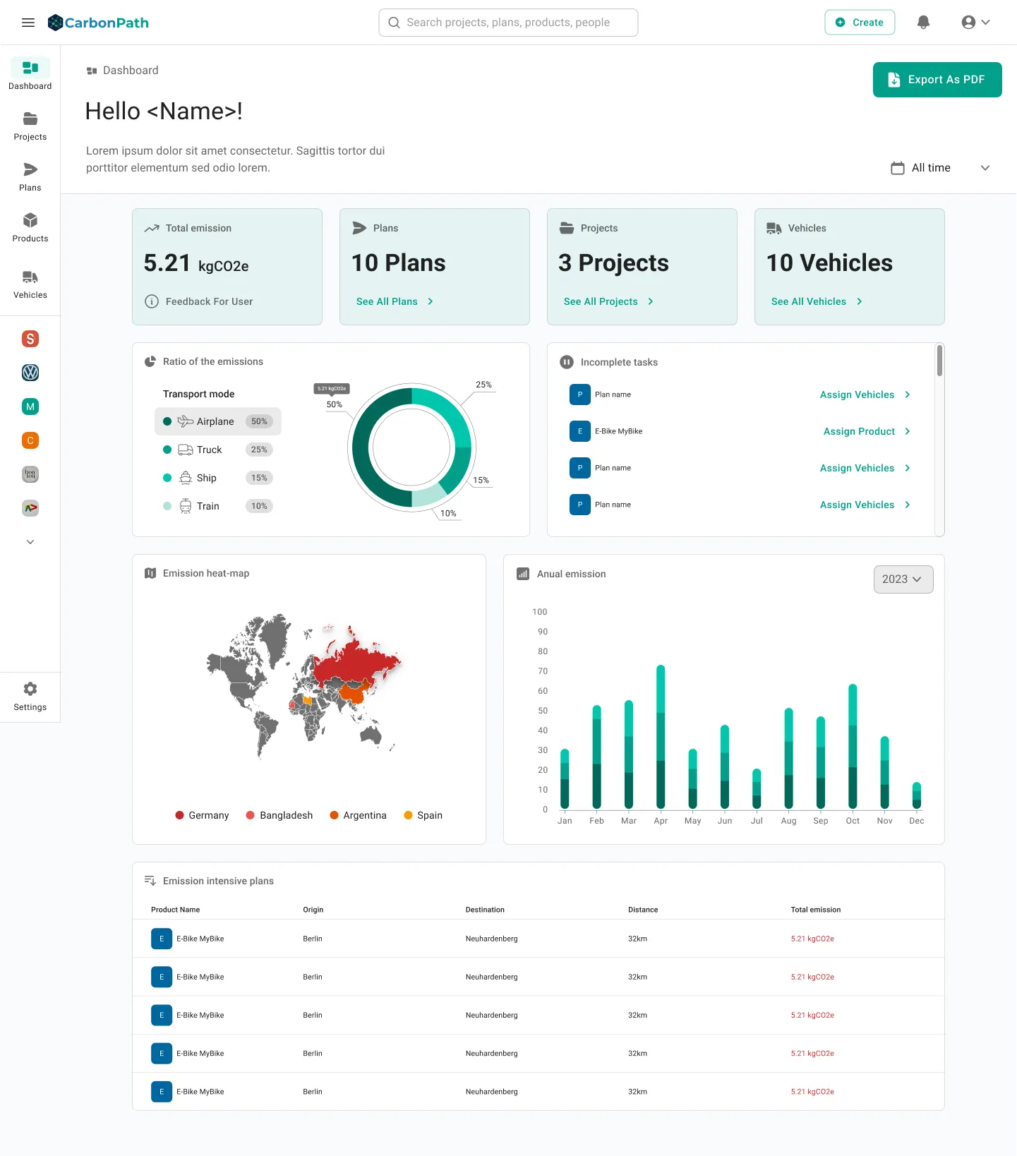
CarbonPath dashboard with emission ratio, heat-map and annual emission charts
03 — EMISSION INSIGHTS
The screen people came for, and the one that scored lowest

Participants called it informative, filterable and good-looking — and still rated it 3.3 on both finding and predicting. The layout was fine; the labels were not.

So the redesign changed almost no geometry — every chart title, source and scope on each card, and a plain-language summary on the date filter.

Incomplete tasks sit on the dashboard on purpose: the fastest way to make a number defensible is to show which plans are still missing a vehicle.

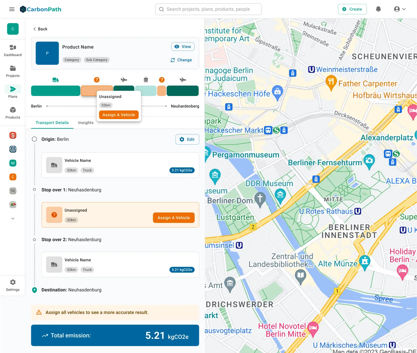
Plan transport details with an unassigned vehicle flagged in amber
04 — PLANS
Missing data, made impossible to miss

An unassigned leg is now amber in the route bar, amber in the list, and says so above the total — because a total with a gap in it is not a number you can quote. Distinct status chips per state, and one capitalisation rule across the product: sentence case, no exceptions.

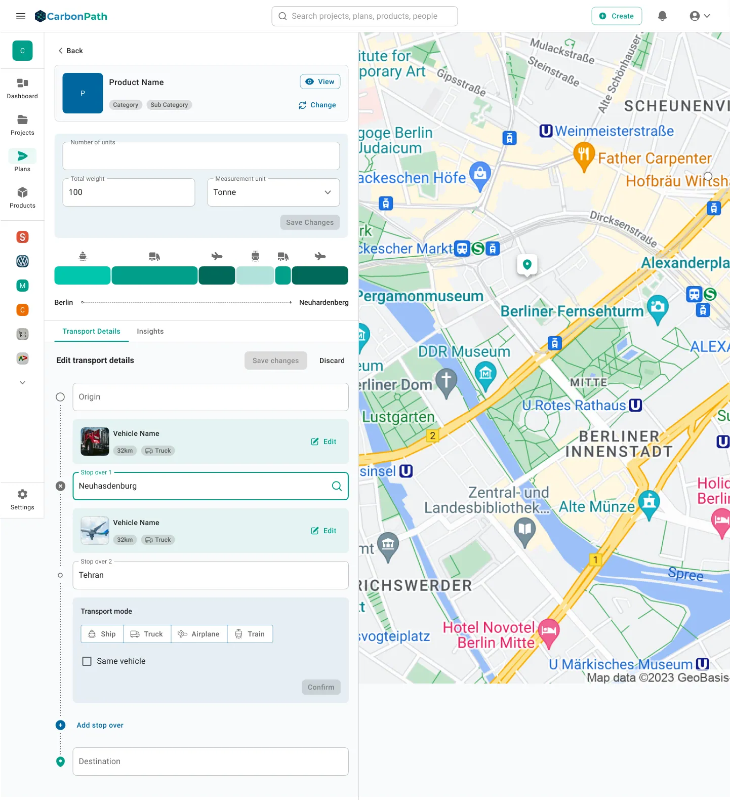
Editing transport details with stopovers alongside the map
05 — ROUTES
Edit on the left, consequence on the right

Stopovers are a list, not a canvas — order matters, each leg carries its own vehicle, and the map is read-only confirmation.

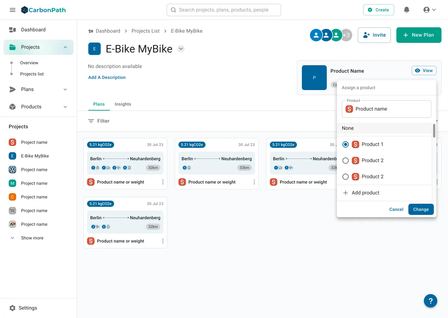
Project view with plans and the assign-a-product dialog
06 — HIERARCHY
Projects vs. plans, settled by the breadcrumb

Plans now live inside the project you opened — nested breadcrumb, plans and insights as tabs, assignment done in place.

Organization settings collaborators table with role selectors
07 — THE CRITICAL FIX
Roles you can actually assign

The role selector now offers only Admin and User; ownership transfer is its own deliberate action.

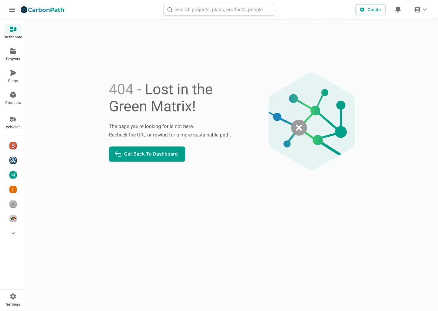
CarbonPath 404 page: Lost in the Green Matrix
08 — EDGE STATES
Even being lost stays on brand

Writing it down

The terminology fix only holds if it is written somewhere. So every input field got a specified label, helper text, error message, constraint and placeholder.
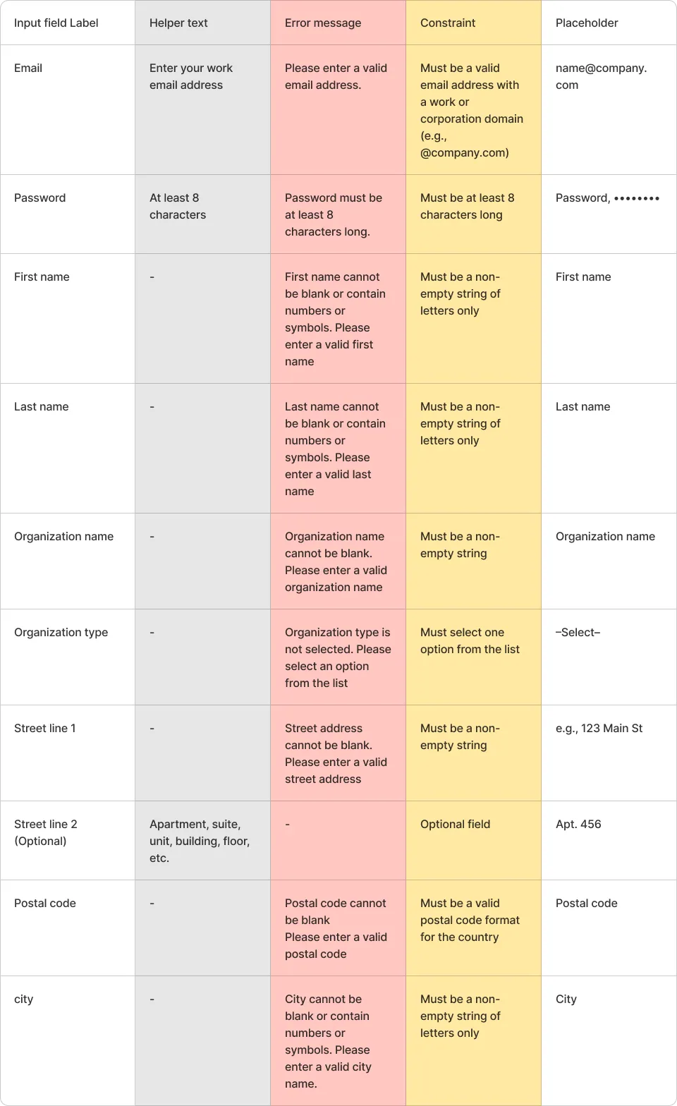
Specification table of input labels, helper text, error messages, constraints and placeholders

Everything else

A sustainability product is judged on credibility, and credibility is cumulative. The logo, the landing page, the sales deck and a LinkedIn post all had to agree.

One small kit — hexagon mark, blue-to-teal palette, type scale, chart styling — and every artefact drew from it, vocabulary included.
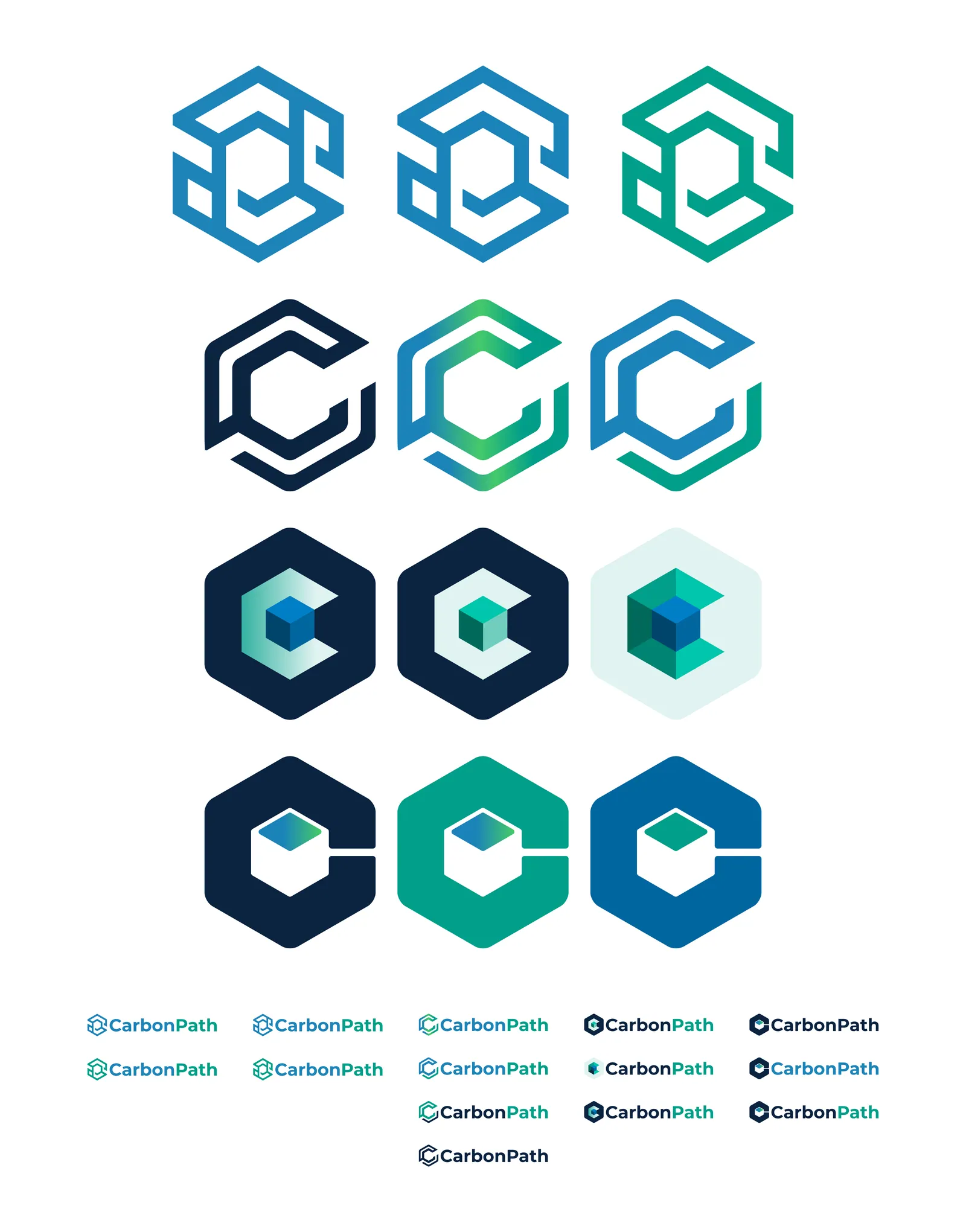
CarbonPath logo exploration sheet
Logo design

C, P and a closed loop inside a hexagon, routed as one continuous path — until one lockup worked at favicon size in a data table and at banner size on a stand.

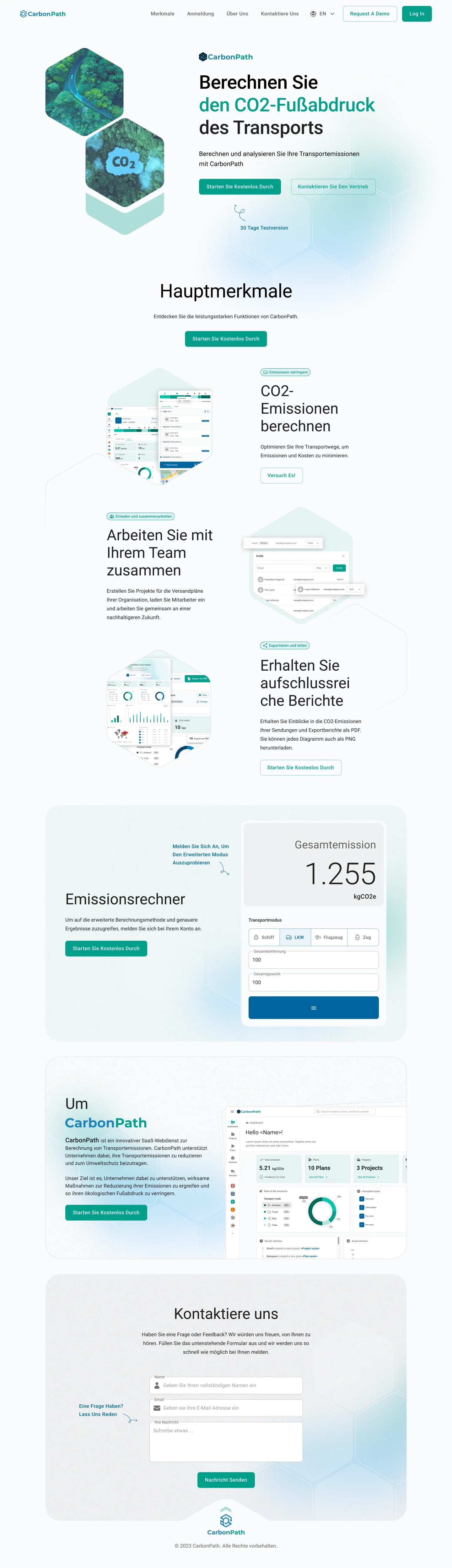
CarbonPath German landing page, full length
Landing page

Written for five audiences by leading with the shared question — what do our shipments emit — then letting a free calculator answer it before anyone signs up.

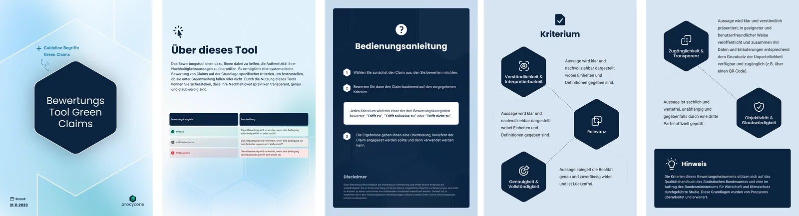
Green Claims assessment tool document spreads
Presentations & documents

Sales and event decks, handouts and the research reports — including the Green Claims assessment tool, a German-language guide turning greenwashing criteria into a three-verdict rating scheme.

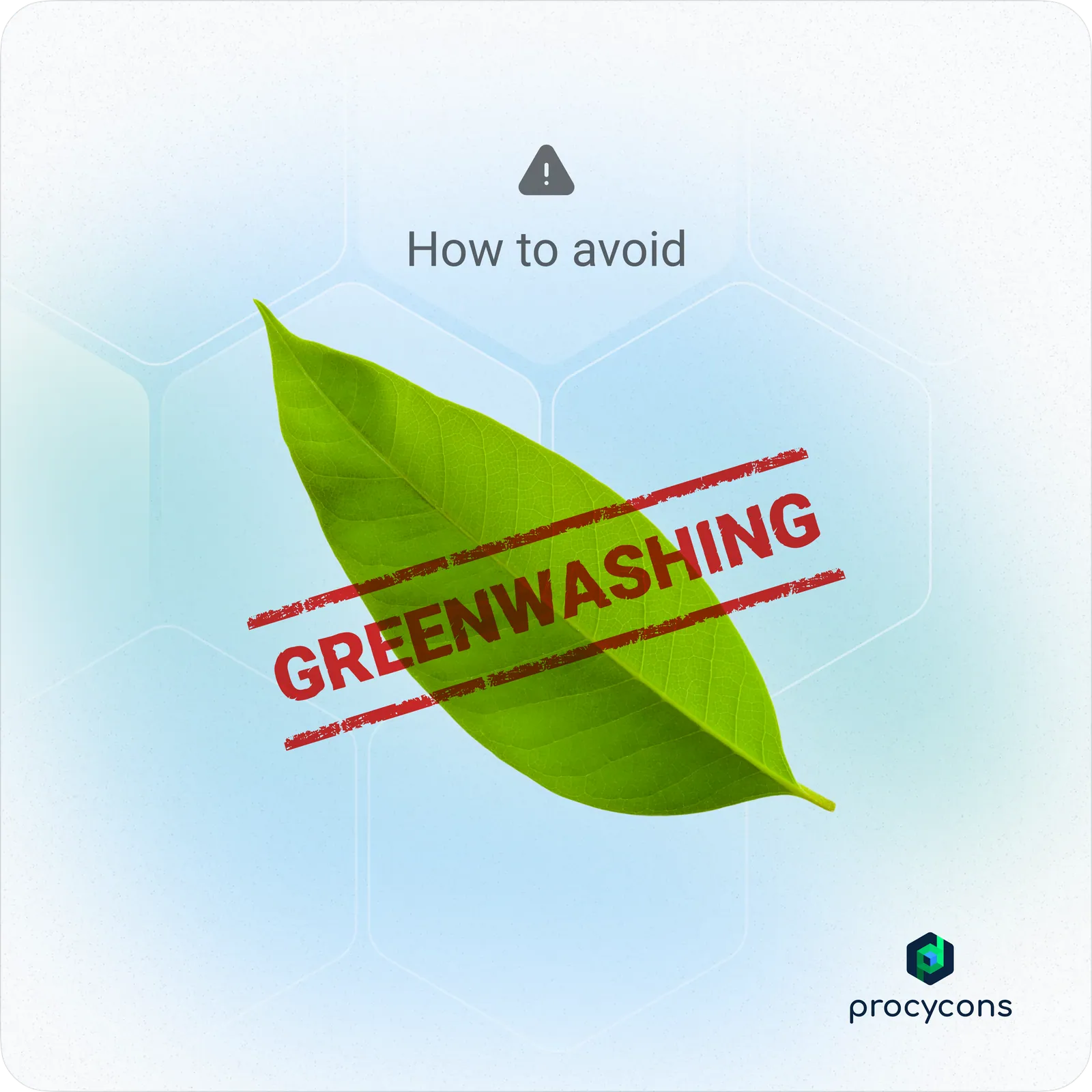
Greenwashing social post
Campaign posts

One idea, one image, one mark — the format the greenwashing series ran on.

CarbonPath launch announcement post
Launch announcement

Product-in-context, with the four verbs the whole positioning rests on: calculate, optimize, monitor, reduce.

Procycons seasonal post
Seasonal & company posts

The hexagon field carried into Procycons-branded moments, so the parent company and the product read as one family.

DECISION I'D DEFEND

I ran the test with four people instead of waiting for eight, and shipped the fixes anyway.

HONEST ABOUT IT

The report says plainly that eight to ten participants is the number for stable results, and that this was round one. Four is enough to find broken things; it is not enough to claim a rate.

THE FINDINGS WERE UNANIMOUS

All four hit the same terminology wall and the same ownership trap. A fifth participant was not going to change what to fix first.

COST OF WAITING

A launch date was fixed. Recruiting to ten would have moved the fixes past it, which means shipping known defects to be more rigorous about them.

Outcome

A product that reads as clear, and a company that had never tested one before.

Launched

CarbonPath went live with the post-test vocabulary and the corrected invitation flow.

A bug caught pre-launch

The partially-saved-plan failure was found in a session, not by a customer.

Testing became routine

The protocol, the rating scales and the report format were reusable — round two ran on the same template.

One vocabulary

The thirteen contested terms got a single written definition, reused in the app, the handouts and the site.

What I'd change: the participants were all internal. They are pro users of the domain, which is exactly why the terminology problem was so telling — if LCA-adjacent colleagues could not define "emissions intensity" on this screen, a purchasing manager certainly could not. Round two needed real customers, and a task written specifically around defending a number to someone else.

TRY IT
touch_appPrototype

From a number on a dashboard to the vehicle that caused it

Carbon accounting is only useful if you can trace a total back to a decision. Click through and the chain holds: dashboard, project, the plan, and the transport leg with the unassigned vehicle flagged.
touch_appInteractive — click through the product
CarbonPath — Dashboard
CarbonPath — Project — assign a product
CarbonPath — Plan — transport details
CarbonPath — Editing transport with stopovers
CarbonPath — Create product — details