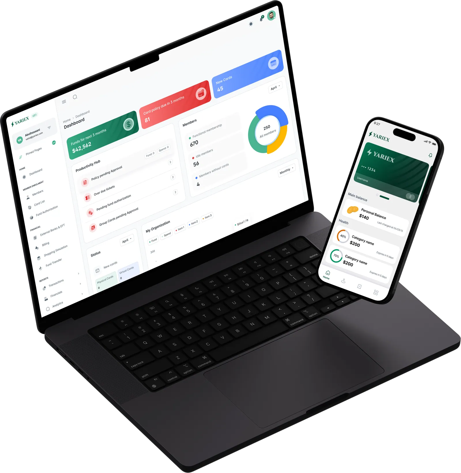
A white-label card platform, made legible on every screen it lives on.
- Problem
- A single Yariex card carries several restricted balances at once. That structure is the platform’s real advantage, and the interface hid it.
- My role
- Product designer across four surfaces — web, dashboard, native app and in-store devices — on one system.
- Outcome
- Live on the web, in the dashboard and on the store.
Yariex issues white-label physical and virtual cards for insurers, NGOs and lenders — programs where a single card carries several restricted balances at once.
That structure is the platform’s real advantage, and it deserved an interface that shows it off. I came in to redesign the marketing site, rebuild the administrator dashboard, design the native app and produce the store presence — the chance to make four surfaces finally behave as one product.
An insurer or NGO deciding whether Yariex can run their program. Wants the offer legible inside ninety seconds — so that became the brief for the site.
Runs the program daily and signs in to answer two questions: what’s owed, and what’s waiting on me. The dashboard now answers both above the fold.
Spends against balances someone else set up, at merchants they need to find. Everything they need has to be obvious on first open.
Make a multi-balance card as easy to read as a single one.
Health, dental, food — each with its own cap and expiry. Surfacing them individually turns a confusing total into a set of clear, spendable amounts.
Category cards authorise at in-network merchants. Putting that network on a map turns a rule into a feature people actively use to plan.
The admin view held the right data in an analytics frame. Promoting the items blocked on a person gives every session an obvious next action.
Three rules carried every screen, from the ad to the receipt.
A ring, a figure and an expiry line per category. Burn rate and deadline read in one glance, grouped under the program that funded them.
Coverage on a map before the trip. Approvals in a queue, not inside a chart. Each answer sits in the moment it’s needed.
Green funded, amber attention, red blocked — the same three across marketing, dashboard and app, so the rule is learned once and pays off everywhere.
The site now leads with the card — product first, proof second, everything else after.

home Home. The card fan opens the page with its four value props pinned directly to it, so the claim and the object it describes stay together. A single scroll cue leads into product, solutions, testimonials and FAQ in decreasing order of commitment.
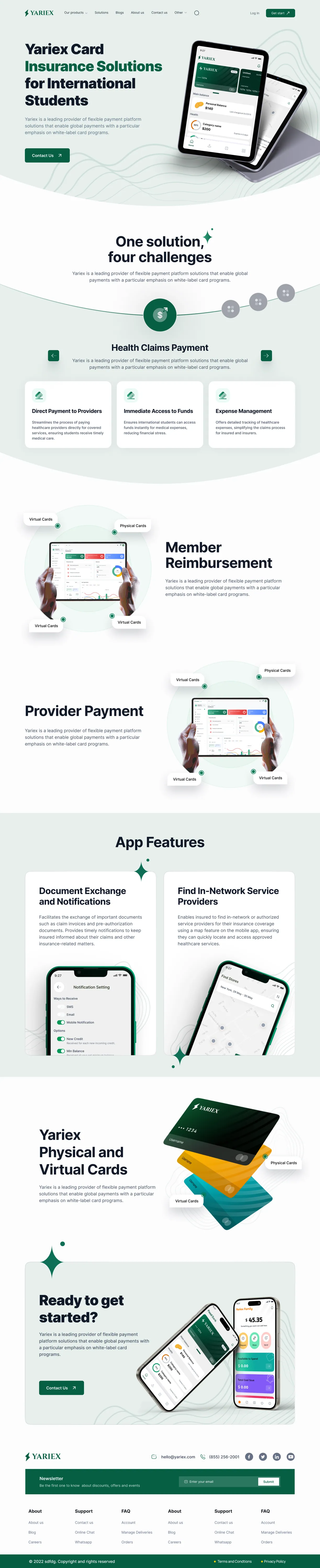
dashboard_customize Vertical template. One reusable shell per market — here, insurance for international students. “One solution, four challenges” runs as a stepped carousel, so each vertical swaps in its own four without a new layout.
smartphone Home, mobile. The card fan tilts upright and the three pillars stack; the organic green shapes carry the section rhythm the desktop grid handles.
Built for the two-minute check-in: money, deadlines, and the queue of things waiting on a person.
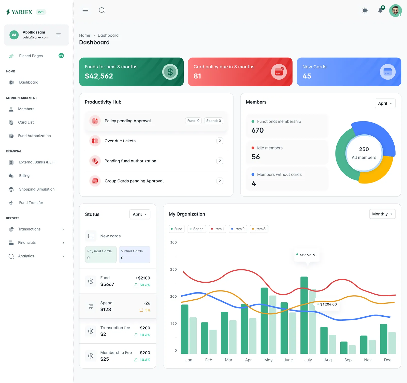
monitoring Dashboard. Three answers above the fold as colour-coded stat bars, with the Productivity Hub queue underneath. The same colour rule runs from the bars through the members donut and the organisation chart, so a scan reads as status before it reads as data.
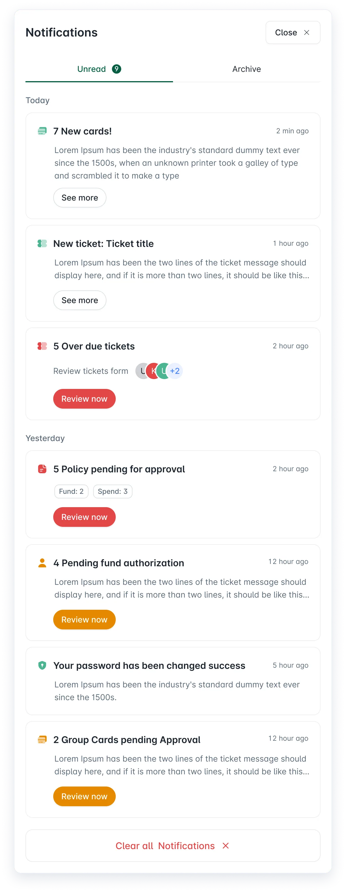
Blocking items carry a Review now button in their own severity — red for overdue tickets and policy approvals.
Amber marks work that’s waiting but not late — pending fund authorisations and group card approvals.
Informational items get a quiet “See more”. Grouped by day, split Unread / Archive, with the count on the tab — so the header badge always has somewhere to resolve to.
Four tabs: your money, where to spend it, your receipts, everything else.
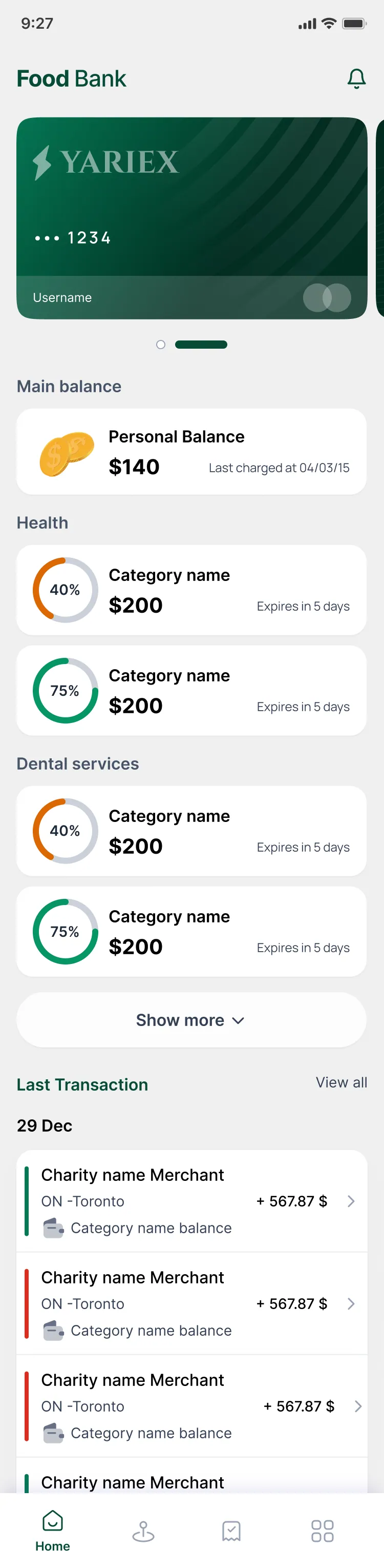
donut_large Home. Card carousel, then balances grouped by program — each ring showing spend against cap and days to expiry.
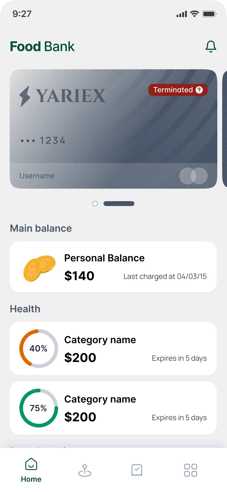
credit_card_off Terminated card. The card desaturates and takes a labelled badge with a help affordance — state is read on the object itself.
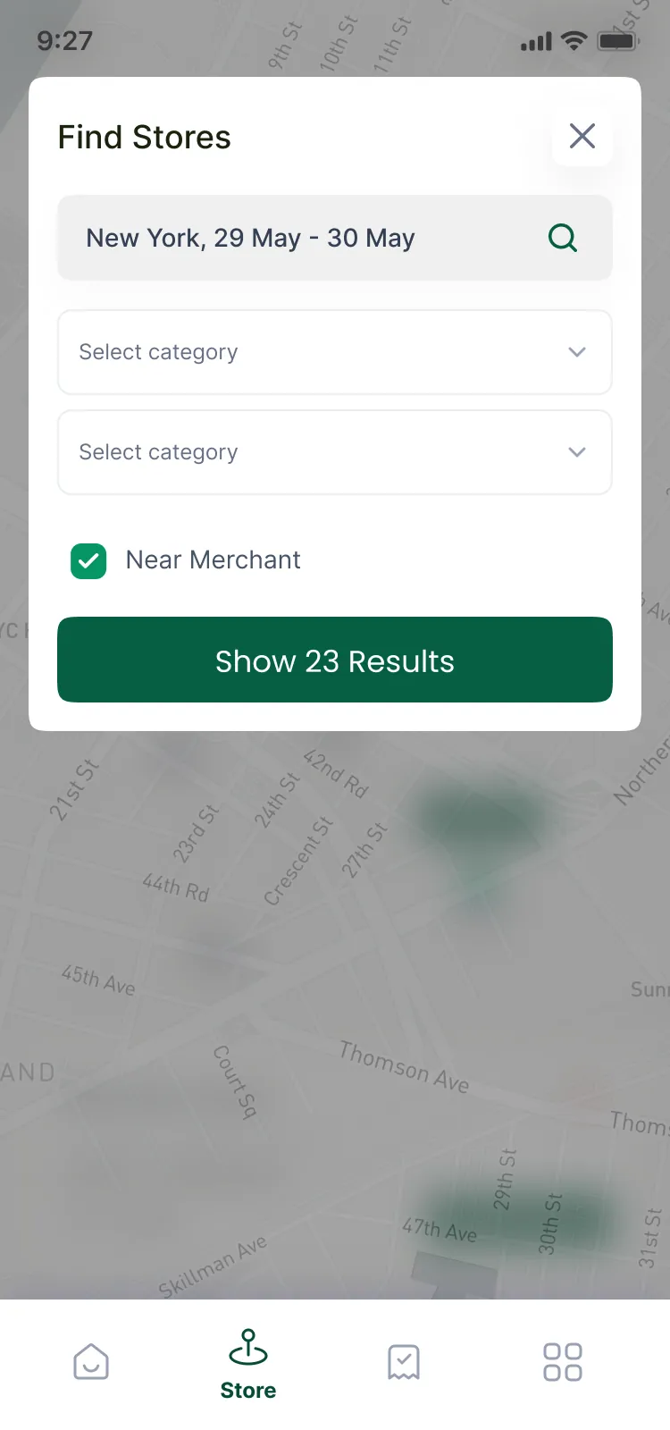
event_available Find stores. City and date range in one field; the button commits with the result count already in it.
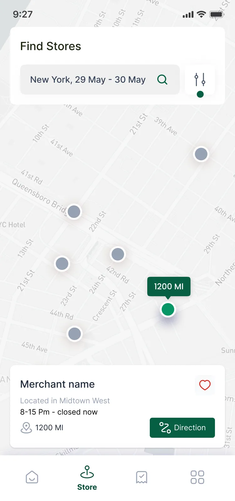
map Map results. A muted basemap so the selected pin, its distance callout and the merchant sheet carry all the weight.
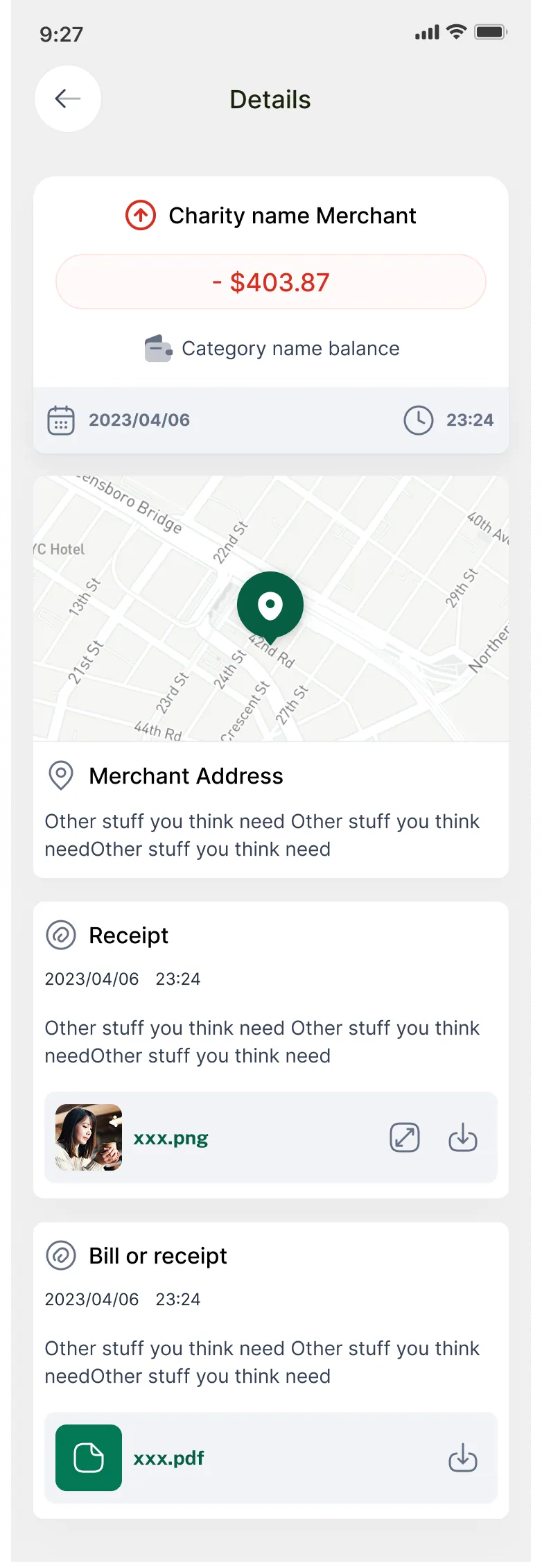
receipt_long Transaction detail. Amount, balance charged, location, then receipts as attachments — the reimbursement trail in one scroll.
Searching by date as well as place — because coverage and opening hours change over a trip, not over distance.
The listing is the first screen of the product.
Icon, feature graphic, phone and tablet screenshot frames, captions — plus short motion pieces of the card carousel, the balance rings filling and a store search resolving on the map. One caption grammar throughout: a light verb over a bold noun, on alternating deep and pale green panels, so the strip reads as rhythm when it’s swiped.

shop Google Play set. Icon, feature graphic and five captioned screens, checked against the live listing preview — the point where the strip is seen at thumbnail size and the captions have to hold up.
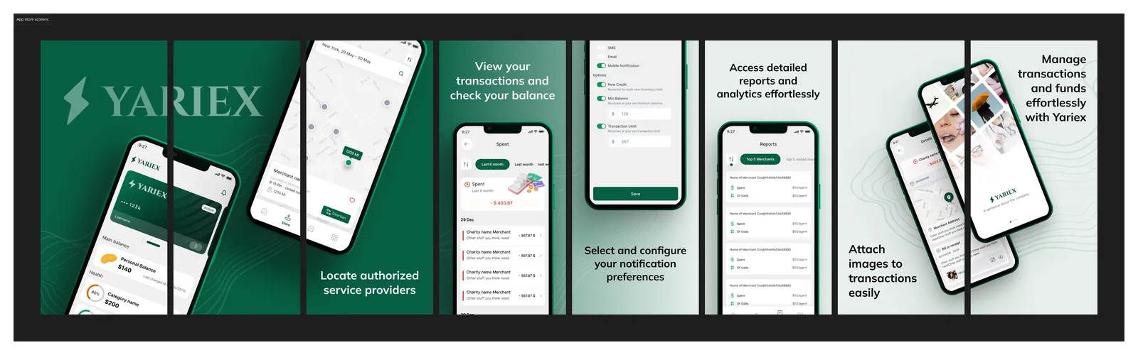
view_carousel App Store set. Devices break their panel edges and continue into the next frame, so consecutive screenshots read as one continuous scene rather than seven separate cards.
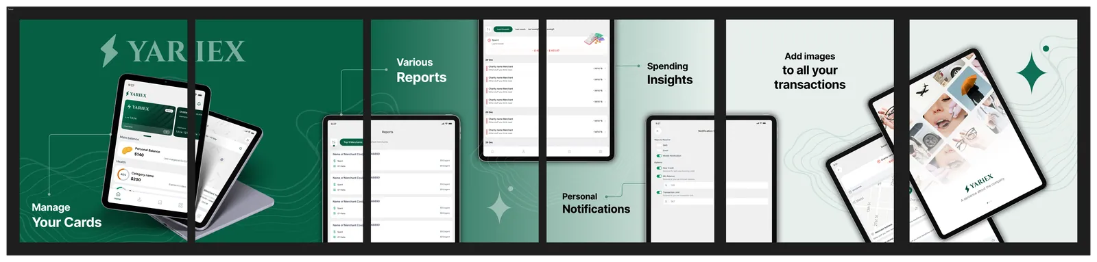
tablet_mac Tablet set. The wider frame gets thin connector lines from each caption to the element it names — room the phone crop doesn’t have.
Deep green is the brand and the safe state. Amber and red are reserved for status — so a cardholder learns to read colour as information once, and it keeps paying off across marketing, dashboard and app.
DEEP
BRAND
POSITIVE
ATTENTION
BLOCKED
SURFACE
Yariex is live — on the web, in the dashboard, and on the store.
From sign-in to a transaction you can read
Multi-balance is the hard part. This is the run that had to stay obvious: see which balance you are spending, read a single line on the statement, then find somewhere to spend it.