A social feed for traders, where credibility is part of the interface.
- Problem
- Crypto traders already had distribution. Nothing on the screen told them who to believe.
- My role
- Research and IA, auth and posting flows, the web app, the mobile feed and the marketing site — plus the decision documents that locked the design system, type, icons and palette.
- Outcome
- A concept taken to working prototype: a track record that travels with every post, and a nine-reaction set that lets a reader register doubt, not just approval.
Crypto traders already live on a general-purpose social network. The problem was never distribution — it was that nothing on the screen told them who to believe.
A founding team came to me with a thesis: a trading feed where a poster’s track record travels with every post. I ran the research, set the information architecture, designed the auth and posting flows, and built the web app, the mobile feed and the marketing site — plus the decision documents the team used to lock the system, type, icons and palette.
Scrolls between positions. Wants a call, the reasoning behind it, and some evidence the person calling it has been right before.
Publishes charts, voice notes and live streams. Reputation is the product, so it has to be visible and hard to fake.
Arrives having been burned by a paid group. Needs a way to register doubt publicly, not just scroll past.
Make trust something the UI can carry.
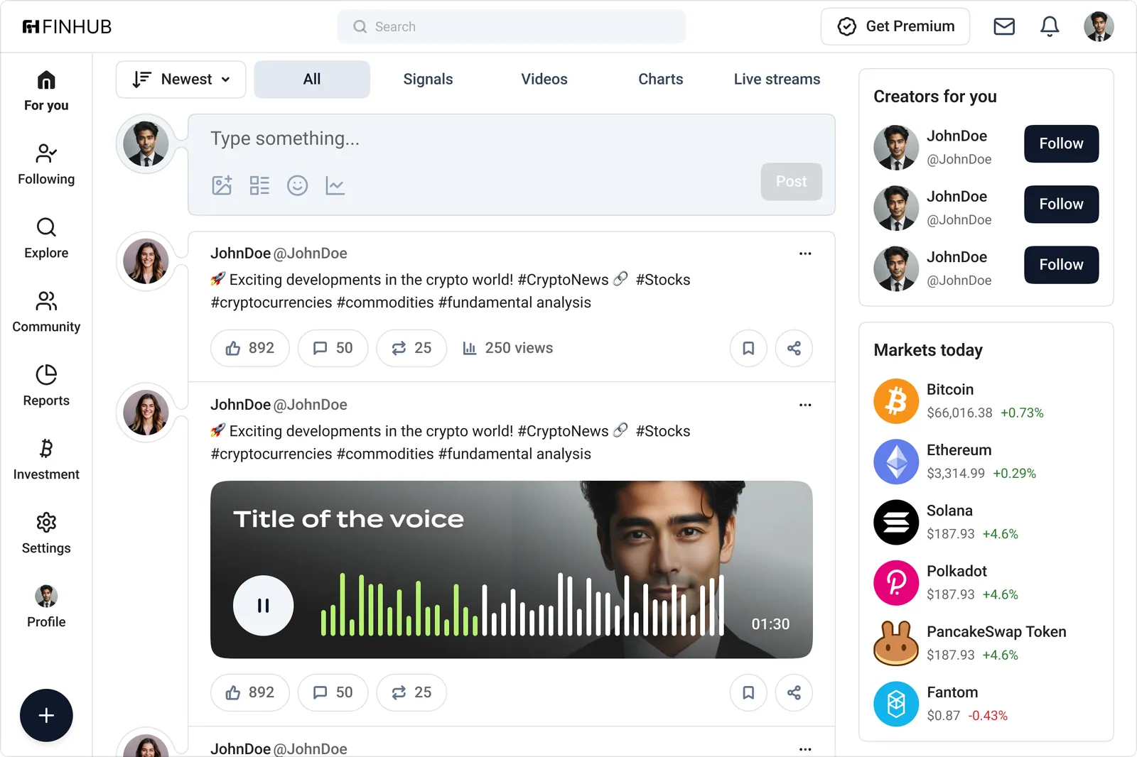
A win rate sits beside follower count on every profile, at the same size. One number is reach; the other is whether the reach was earned.
“Risky”, “Doubtful” and “Explain” are things traders actually say about a call. The reaction set had to include disagreement, or the feed would only ever look bullish.
Live prices stay pinned in the right rail. Reading a claim about Solana and checking Solana should not be two different places.
Three rules decided the arguments before they happened.
Verification, win rate and reaction mix are attached to the author, not buried in a profile. If a claim gets reposted, its evidence comes with it.
Skepticism gets its own family in the reaction set, and its own colour weight. A platform that only measures approval is a platform that rewards hype.
Text, chart, video, voice note and poll all sit in the same card frame with the same action row. Format changes; the grammar does not.
No users to interview yet — so I studied the products traders were already leaving.
Secondary research plus SWOT on the closest analogues — a decentralised social network, a mobile-first Web3 app, a paid research platform. The pattern across all three: strong ownership story, weak signal quality.
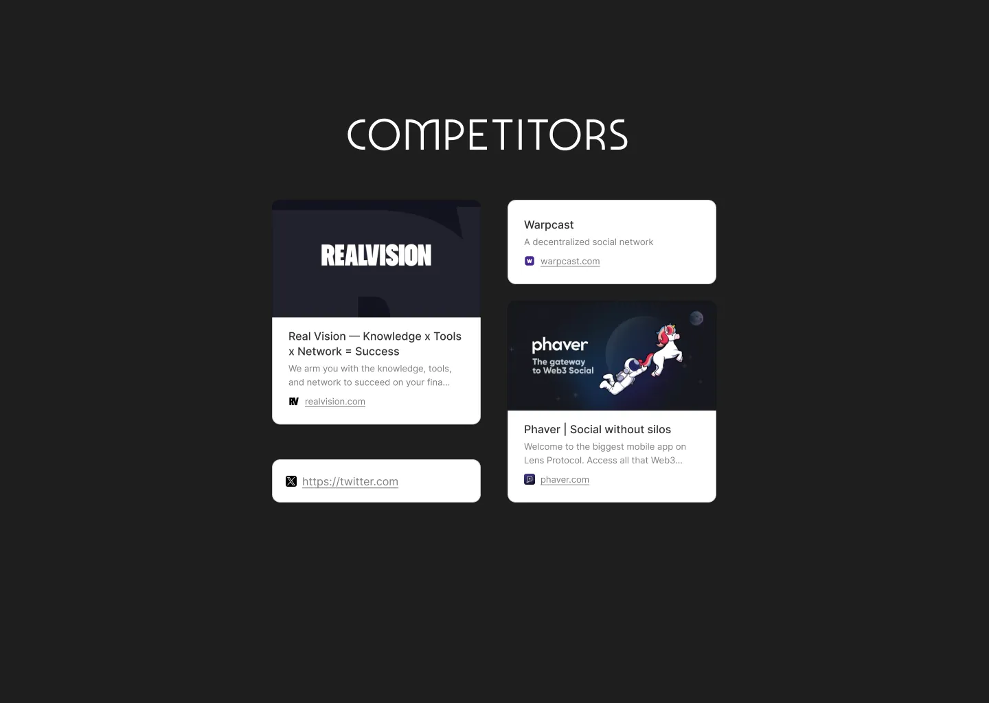
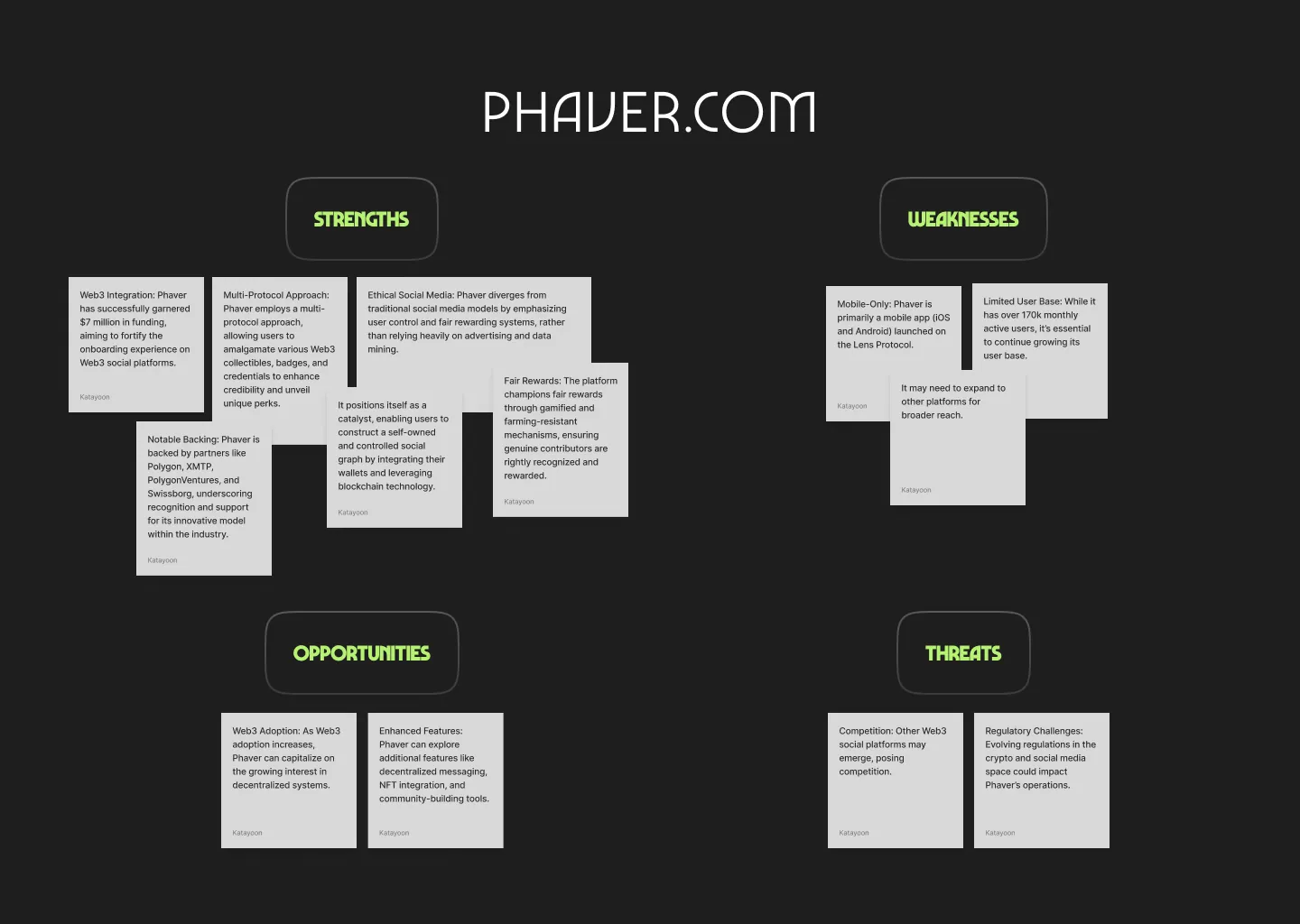
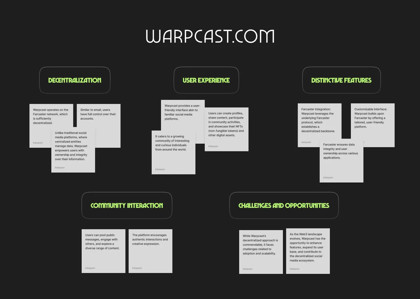
insights What the boards agreed on. Every competitor sold decentralisation as the benefit; none helped a reader judge a single post. That gap set the product: keep the familiar feed mechanics, spend the novelty budget on judgement.
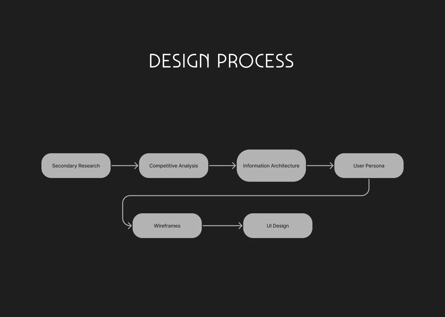
route Six steps, agreed up front. With a remote founding team, publishing the process — six steps on a shared whiteboard the founders could walk into — was the cheapest way to stop “can we just look at screens” happening in week one, and the reason the decision documents got read instead of forwarded.
Foundations were bought decisions, so I documented them like decisions.
Design system, type, icon pack and palette each got one page: options, risks, price, licence, a recommendation and a next step — everything needed to approve a purchase without a meeting.
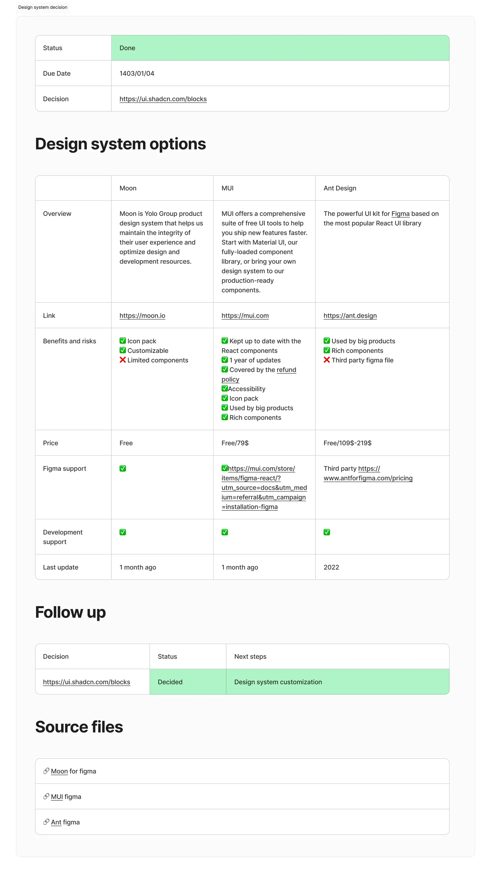
dashboard_customize Design system. Three kits compared on components, Figma parity, dev support and last update. The winner was the one the engineers could install, not the one with the prettiest file.
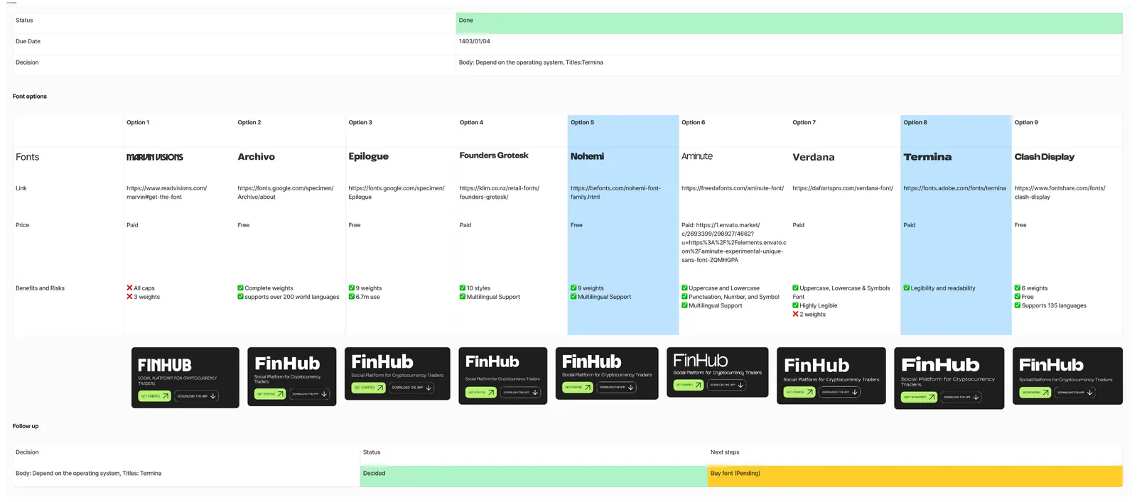
text_fields Type. Nine candidates set on the real hero block, not a specimen sheet. Display face for brand voice; system stack for body, because a feed is read at 15px on cheap screens.
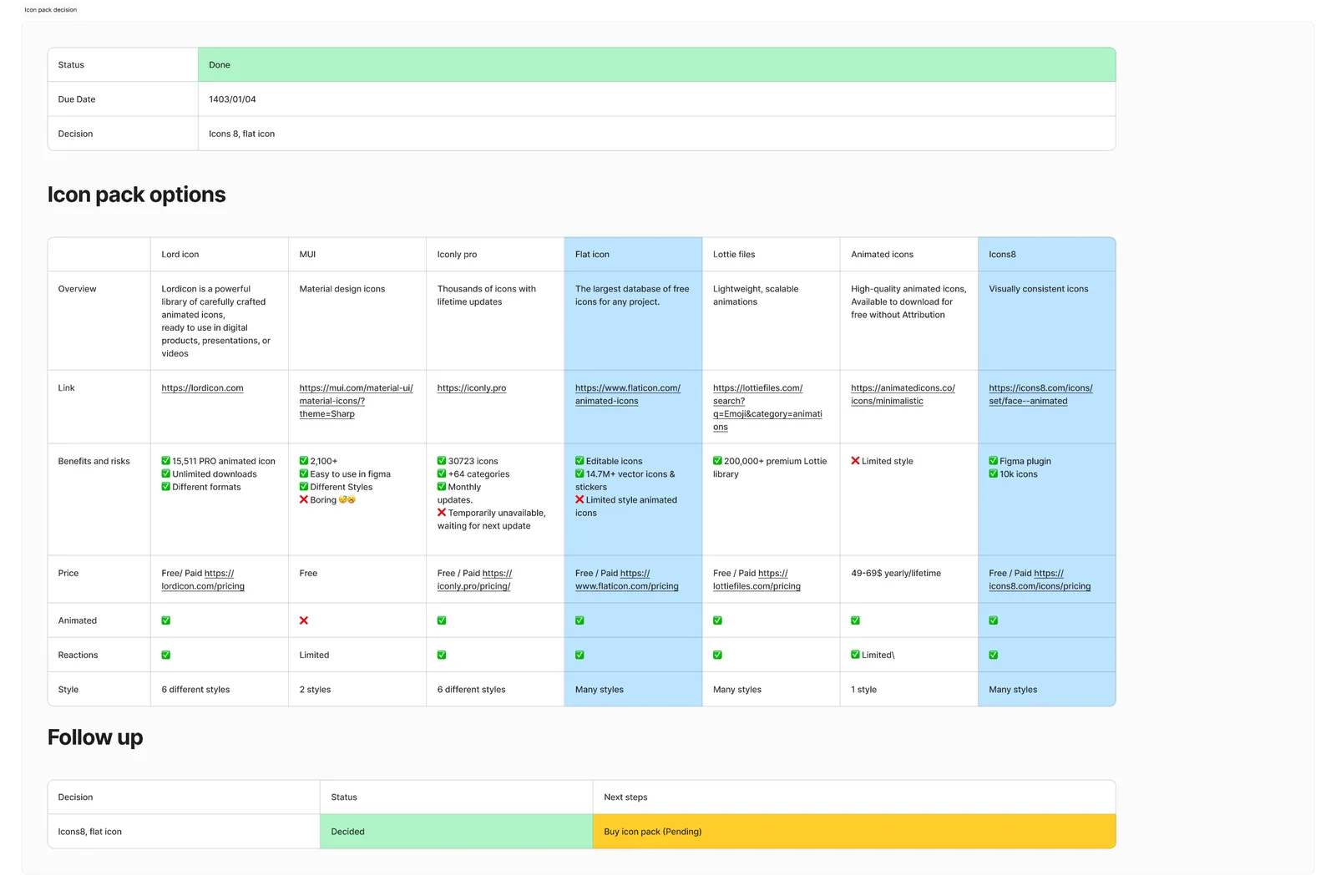
interests Icons. Seven libraries scored on animation, reaction coverage and style range — because the reaction set needed nine distinct, legible expressions from one family.
contrast Palette. Seven options run through WCAG 2, APCA and an unmoderated impression test. Taste picked the shortlist; contrast maths and 200-odd strangers picked the winner.
Seven destinations, one of them a wallet — so the money stays visible, never modal.
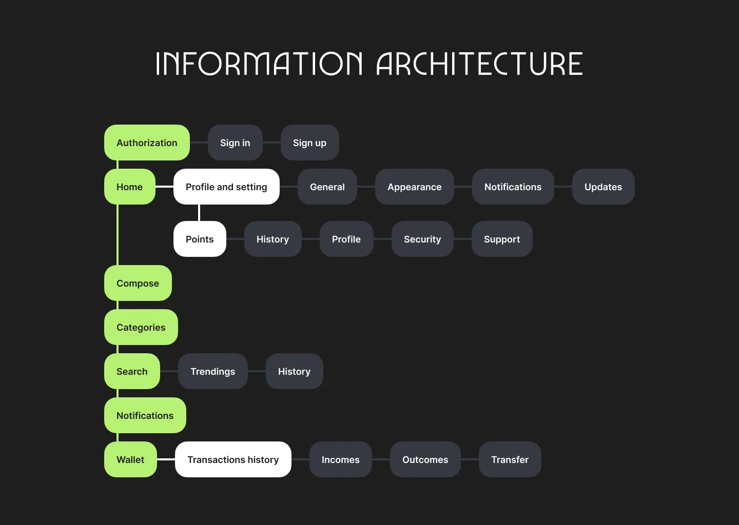
schema The map. Home, Compose, Categories, Search, Notifications and Wallet on the spine; profile, settings and points hang off Home. Points sit two clicks from the feed, because earning is part of the loop, not a billing screen.
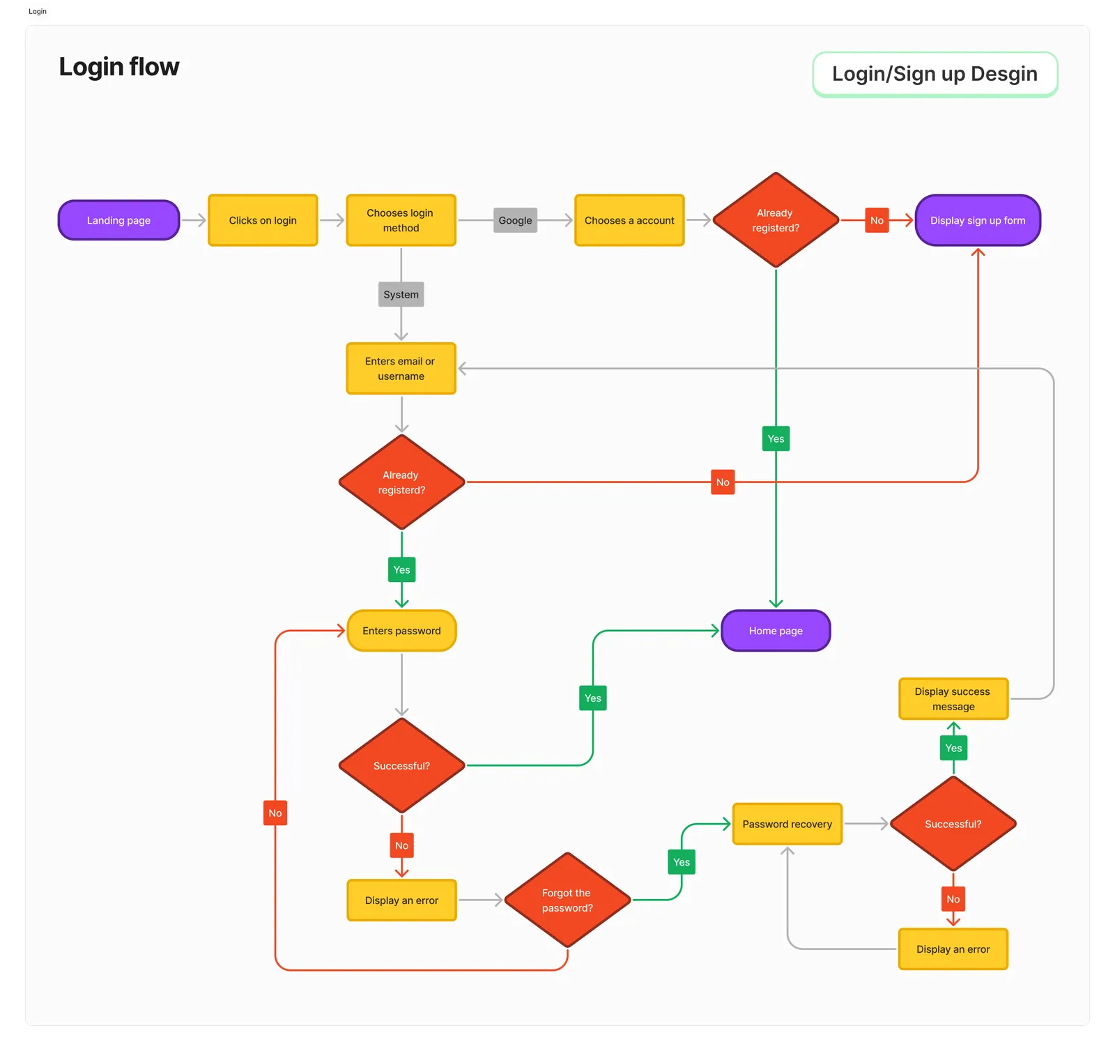
login Login. Mapped to the dead ends, not the happy path: wrong password, unrecognised email, Google account with no FinHub profile. Every failure state has a labelled exit, so recovery never depends on the back button.
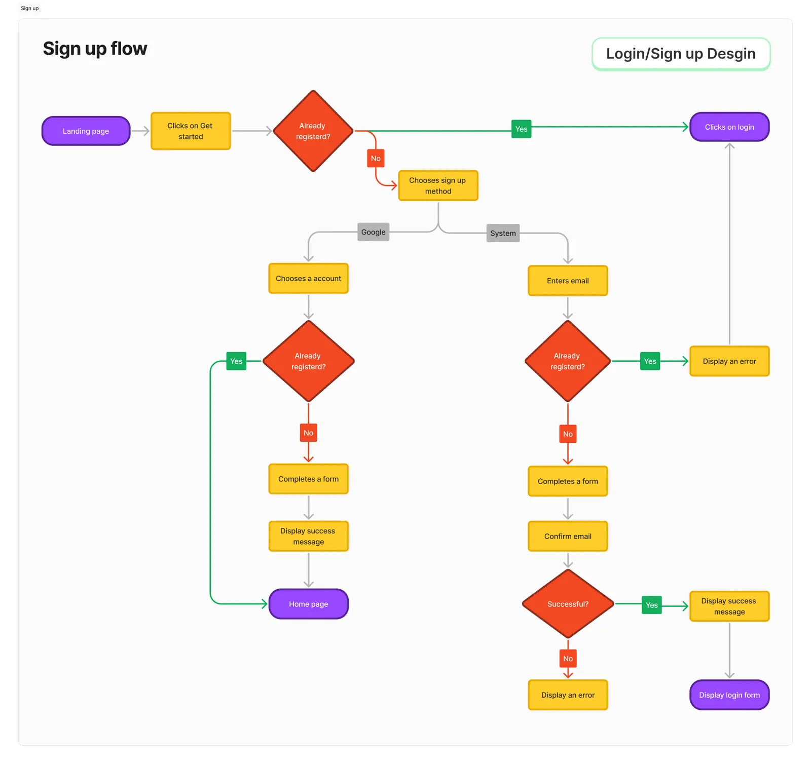
person_add Sign up. Two methods, one shared form, and an explicit “already registered?” branch at the top — the single most common cause of duplicate-account support tickets in the founders’ previous product.
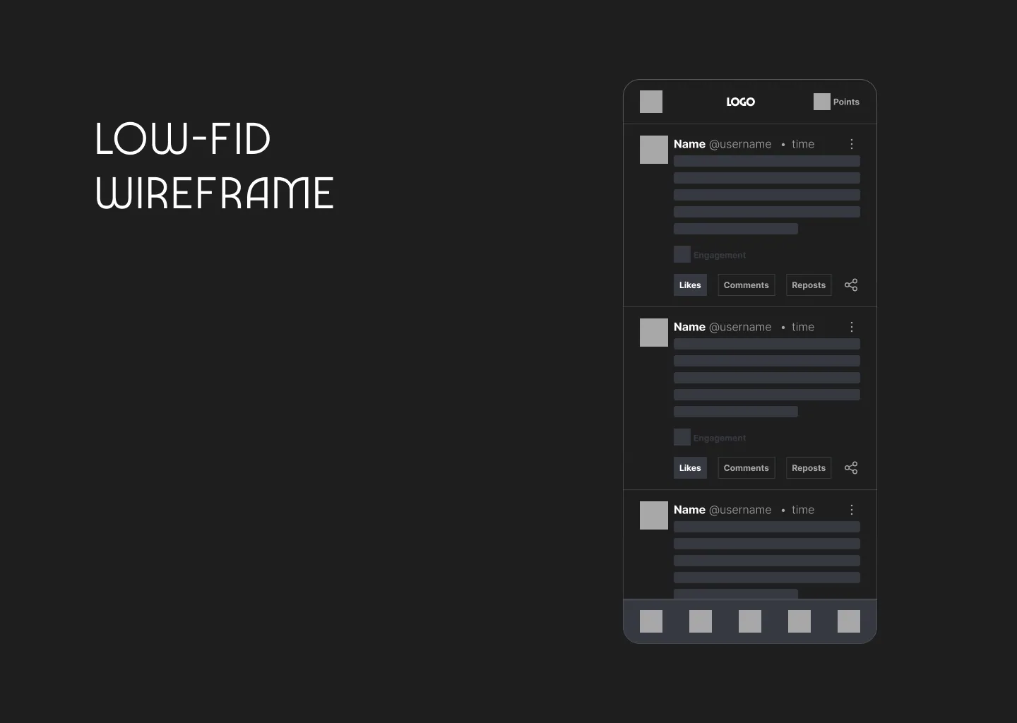
draw Wireframe. The card was settled in grey first — author line, body, engagement strip, then Likes · Comments · Reposts · Share as four equal targets. Points in the top-right from the first sketch.
Nine reactions, four families, one honest verdict.
Insightful and Profitable read positive. Watching and Noted are neutral bookmarks. Explain, Doubtful and Risky carry skepticism. Agreed and True are endorsements a poster can be held to. Aggregate them and a post has a shape, not just a score.
Kept to four, so approval cannot drown the rest. Watching doubles as the save action, which is what people were doing with likes anyway.
Five of the nine are critical or committal. Risky is the only reaction rendered in a warning frame — it is the one a reader should catch while scrolling.
One button, three states: React, hover, and the chosen reaction shown by name. Once you have reacted, the label stops being a verb and becomes your position.
Three columns: where you are, what you read, and what the market is doing while you read it.
dynamic_feed Feed. Sort and content type are separate controls — Newest is a question about time, Signals · Videos · Charts · Live streams is a question about format. The composer sits at the top with four attachment types, so posting a chart is as cheap as posting a sentence.
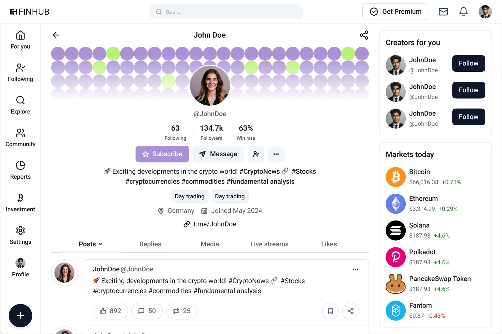
verified_user Profile. Following, Followers, Win rate — three stats, equal weight, and the third is the one that matters. Subscribe is the primary action ahead of Follow, because paid access is the poster’s business model and the platform’s revenue.
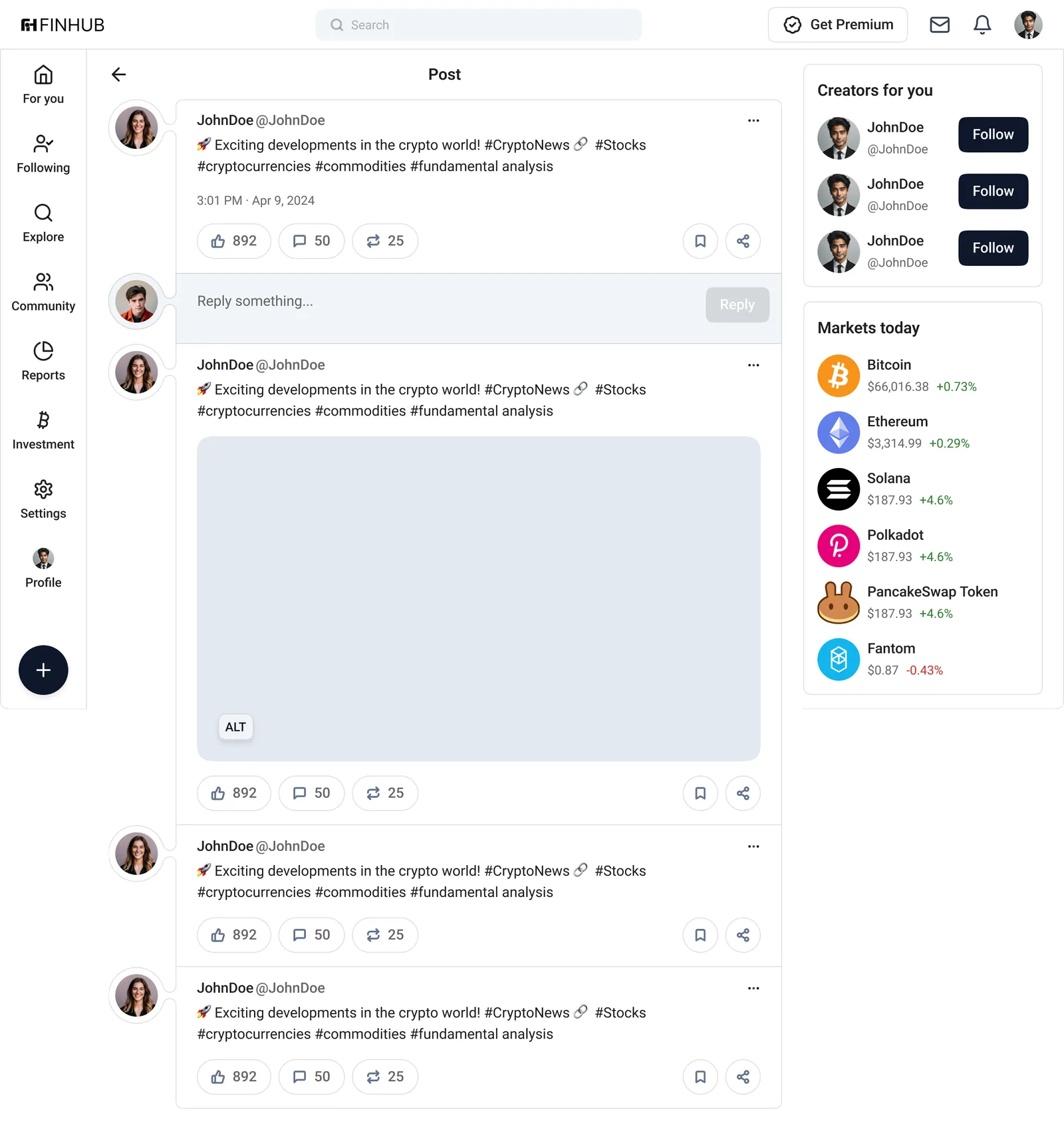
chat_bubble Post detail. The reply box sits directly under the post, tinted so it reads as your turn to speak. Replies below inherit the same card, which keeps a 40-message thread from turning into a wall of variants.
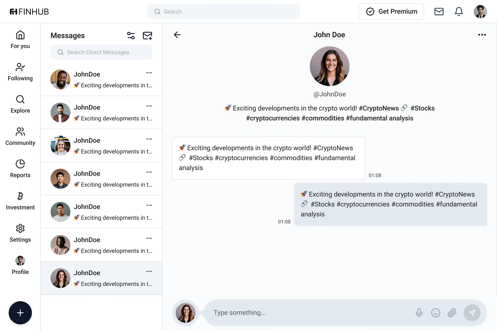
forum Messages. A trading DM is often a voice note or a screenshot, so mic and attachment sit inside the input at full size — not behind a plus menu.
Dark by default, because this is the screen people check at 2am.
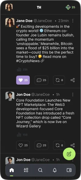
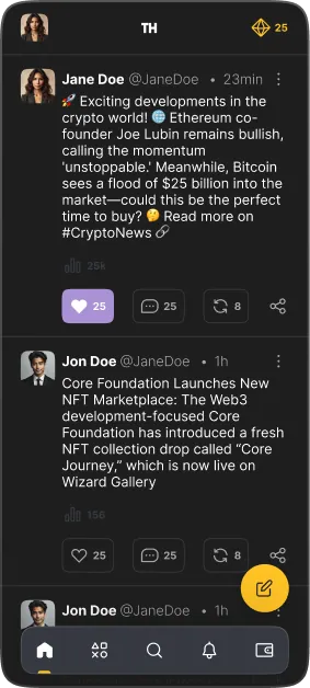
One accent, tested twice. The compose button was the only floating element competing with reaction colour, so it went through both accents on a real feed rather than a swatch board.
Thumb-first. Five destinations in the bottom bar, compose above it on the right. Everything a reader repeats — react, comment, repost — sits in the lower two-thirds of the screen.
Points, always in the corner. Balance stays in the header on every screen, so the reward loop is ambient instead of a place you have to visit.
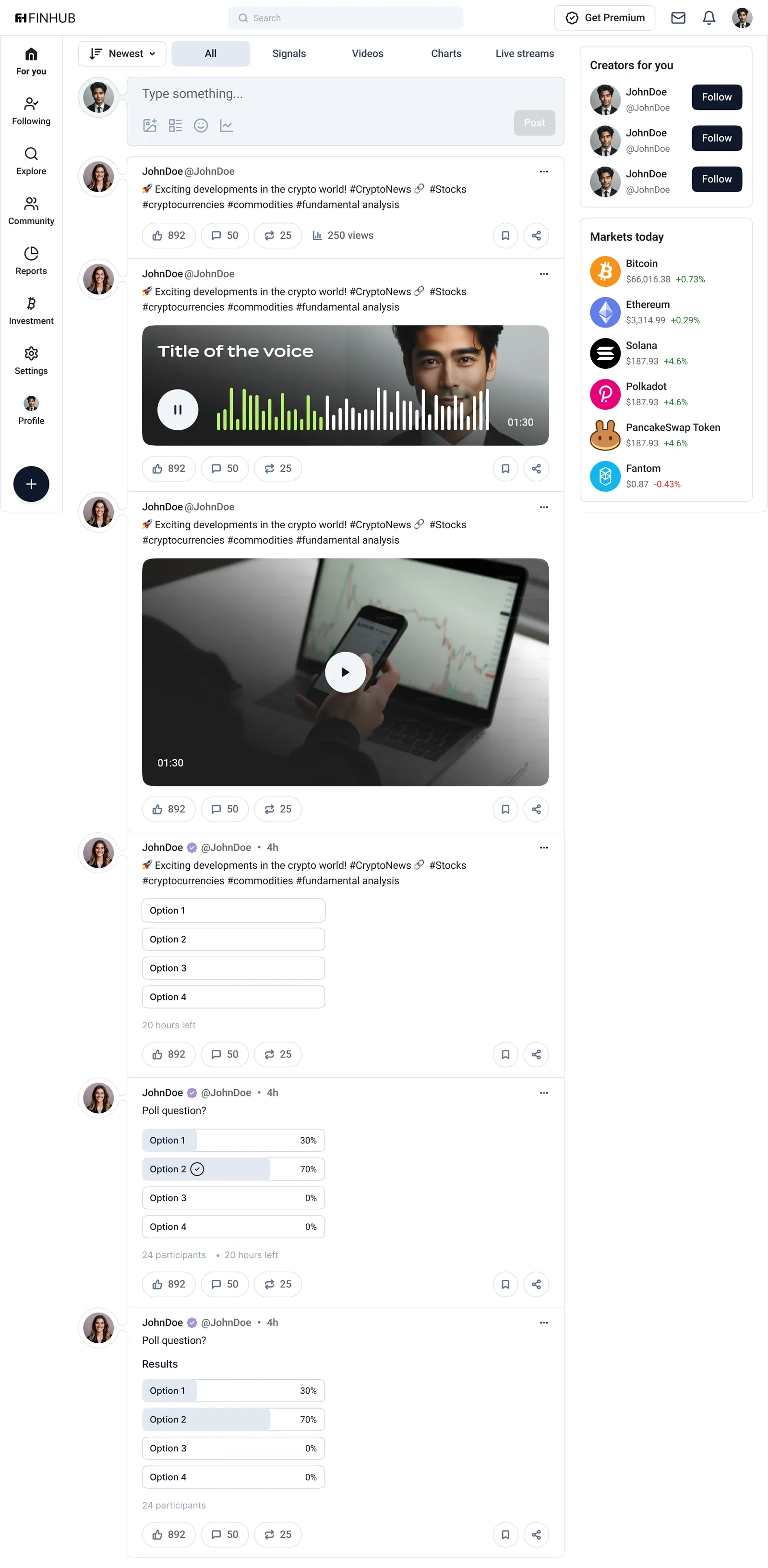
view_agenda Five card types, one frame. Voice notes get a waveform with elapsed colour, video a single play target, polls three states — unvoted, voted, closed — with results always as a percentage bar. The action row never moves between them.
The homepage had one job: name the problem the product exists for.
“In data we trust, in influencers we verify” came out of the research, not a copy session. Underneath it: the top-rated influencers board with real scores, the phased rollout, and one download block — proof, plan, action.

web Full page. Dark for the argument, one violet band for the app download, dark again for the roadmap and team. Two backgrounds across nine sections keeps a long scroll from feeling like nine different websites.
Five brand colours, published as Figma variables and used with a rule each: dark gray carries the product, purple is the only interactive colour, green is reserved for growth and confirmation, slate ink is text and the one dark button per view. Type is Termina for titles and Roboto for everything read at length — the reaction icons bring all the colour a feed can take.
DARK GRAY
GRAY
INK
PURPLE
GREEN
SURFACE